Click to learn more about author Steve Miller.
I came across a jaw-dropping article from the Brookings think tank two weeks ago.
The column noted that “household employment data reported by the Bureau of Labor Statistics (BLS) show that Americans with college degrees can account for all of the net new jobs created over the last decade. In stark contrast, the number of Americans with high school degrees or less who are employed, in this ninth year of economic expansion, has fallen by 2,995,000.” The analysis primarily examined the period 2008-2017, which includes a deep recession, a tepid recovery, and finally a steady expansion of the U.S. economy.
The article also linked to the supporting BLS website. Of course, I just had to get my hands on and play with the data. I love doing this type of simple “data analysis” work, which, in my view, is the use of data wrangling, querying, summarizing, graphing, and statistical techniques to tell an analytic story.
The BLS data ultimately consists of 24 spreadsheets, each housing monthly data from 1992-2017 cross-classifying one of six metrics (civilian labor force, participation rate, employed, employment-population ratio, unemployed, and unemployment rate) by one of four levels of education (less than a high school diploma, high school graduate — no college, some college or associate degree, and Bachelor’s degree and higher). Thus, for example, one can download a spreadsheet of employed, high school grad monthly figures for 1992-2017.
For the analyses below, I included 12 spreadsheets of levels of education by measurements labor force, employed, and unemployed, noting metric and education level in the new file names. I then used Jupyter notebook with the R statistical platform to munge and analyze the data. What follows are notebook cells detailing R code and output from my endeavor.
First, set a few options, load some libraries, and assign the default working directory for the spreadsheets.

Define a generic frequencies function for R data.tables attributes.

Below is a procedure to load the individual spreadsheet data into R. loaddata, invoked by the looping functional lapply, reads and pivots the matrix data format, also “parsing” the file name to determine metric and education levels. Here and below, I heavily use both the R data.table and tidyverse packages.

Gather the data from the 12 spreadsheets into an R data.table named clfall. Munge the data, creating several new variables. The “pattern” of stacking data from multiple files while parsing the file names for additional attributes is a common one in data analysis work. clfall is a hyper-normalized structure that emphasizes rows over columns. data.table is especially adept at the type of grouping/”split-apply-combine” computations required by the normalization.
Again, I note the collaboration of R’s data.table and tidyverse capabilities. It’s testimony to the strength of R’s open source community that neither data.table nor tidyverse is part of core R.

Compute frequencies from several data.table attributes to demonstrate the basic sanity of the data load.


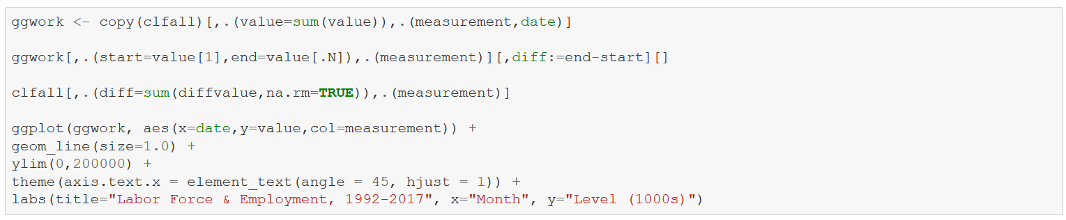
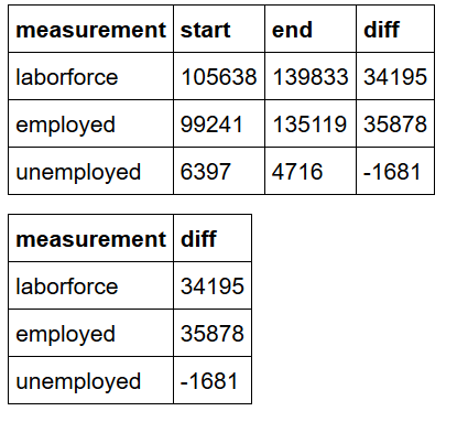
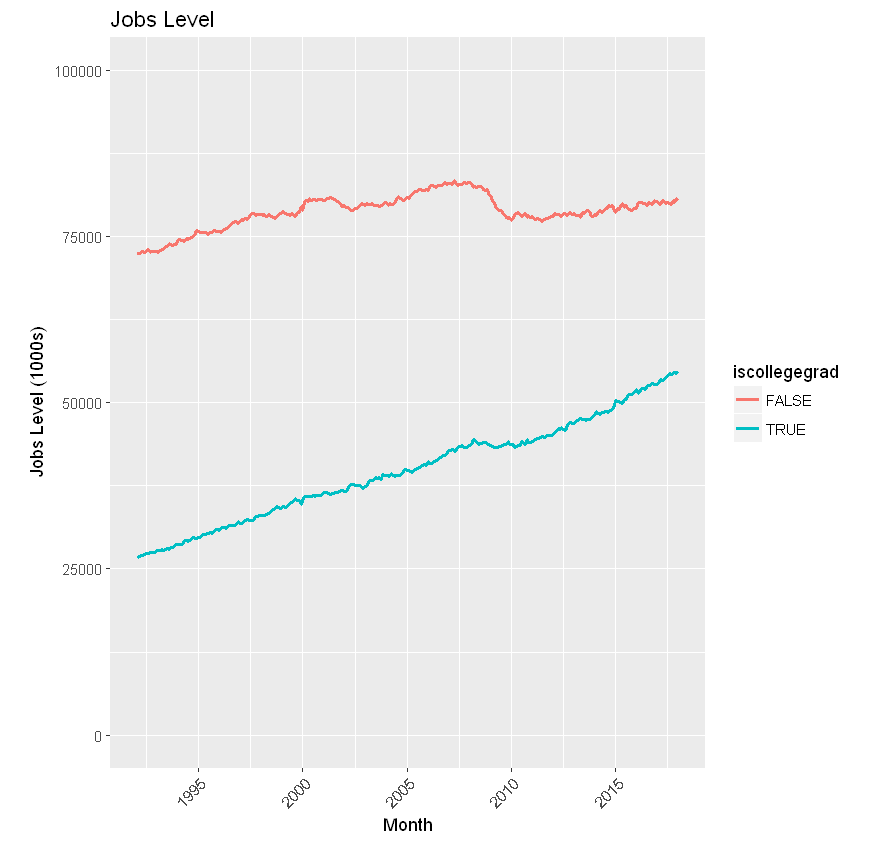
First up is a look at the “levels” of labor force, employment, and unemployment by month from 1992-2017. I use ggwork as a convenience data.table for the graphic. In a production environment, ggwork would be hidden in a function. I also show the growth of laborforce, employed, and unemployed from 1992-2017 with two separate computations. laborforce has increased by 34M during that period, while employed has grown by almost 36M and unemployed has shrunk by over 1.5M. Table numbers represent 1000s; the graph with ggplot displays the journey.

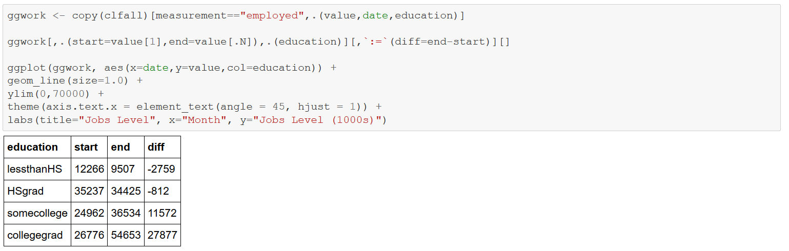
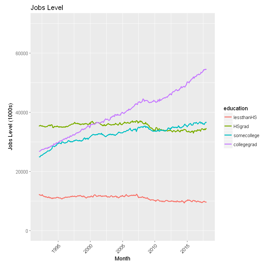
Now consider just “employment”, noting monthly levels by education from 1992-2017. The computations stunningly show the decline in the “lessthanHS” and “HSgrad” categories, along with the accompanying increase in “somecollege”, and the precipitous gains for “collegegrad” — affirming the observations in the Brookings article.
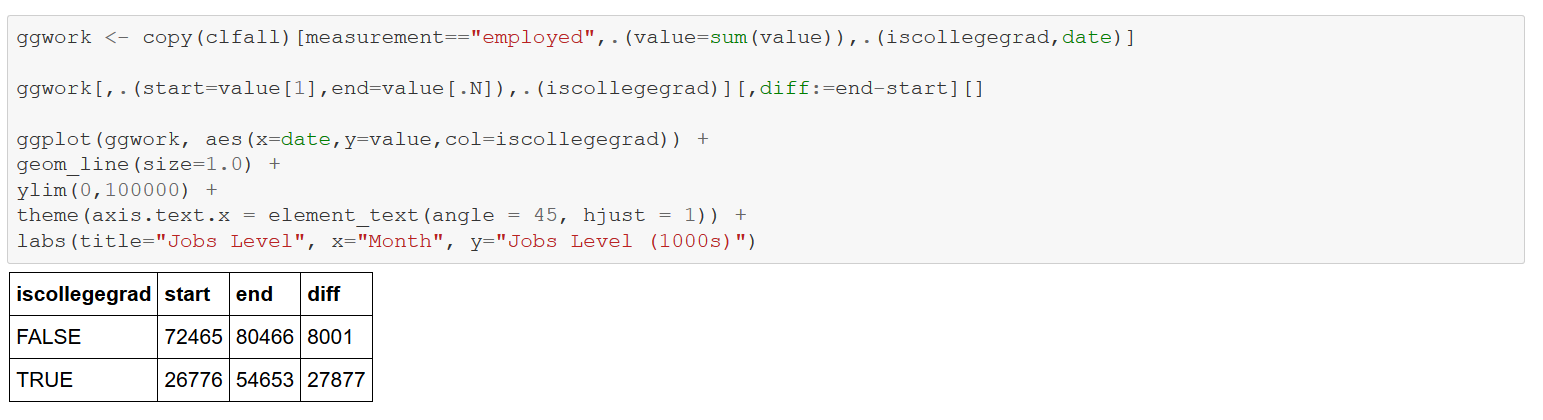
Next consider job levels by the computed variable “iscollegegrad”, Though the level of the FALSE category is higher from 1992 to 2017, TRUE has a much steeper slope and is hence growing at a faster rate.
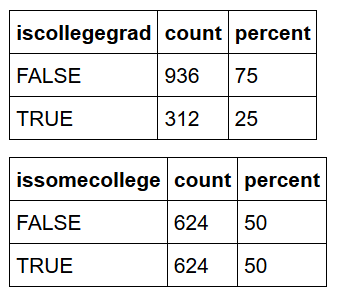
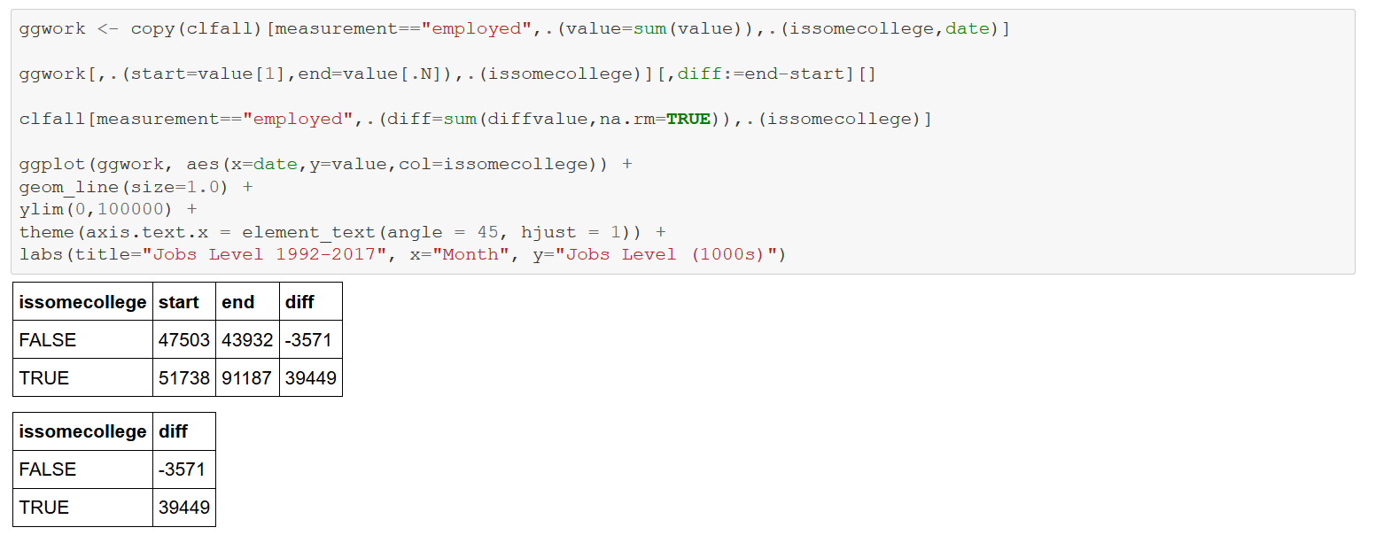
Now combine the “some college” and “college grad” categories into an “issomecollege” attribute. Note the even steeper incline of TRUE and decline of False — “lessthanHS” and “HSgrad”. From 1992-2017, almost 40M with at least some college entered the employment ranks, while 3.5M with a high school education or less left.

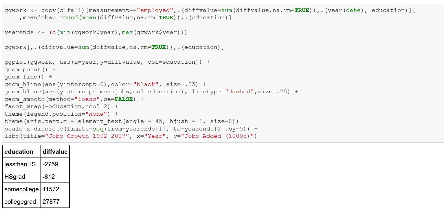
Consider next a faceted graph of monthly job additions by education between 1992-2017 using ggplot. The panels display annual job growth by education level. The thicker solid curves are “smoothers” that “capture important patterns in the data, while leaving out noise”. The dashed horizontal lines indicate average monthly job gains (losses) per education category, again starkly showing the influence of education on jobs in the U.S. economy.
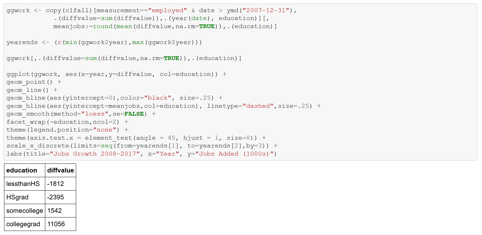
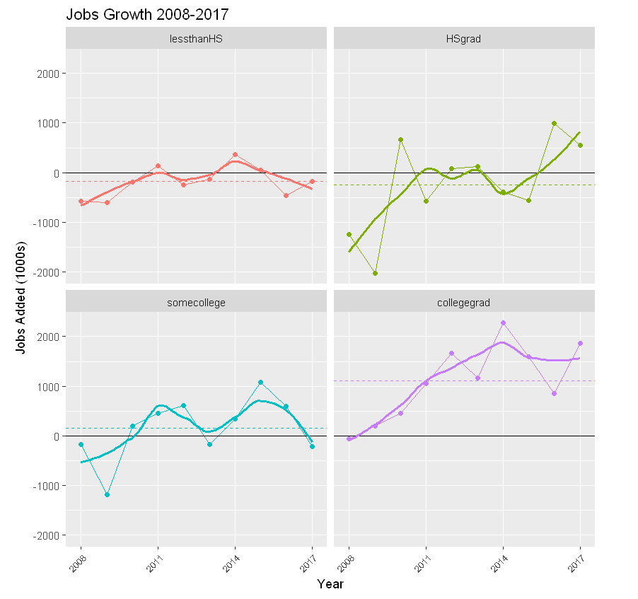
Repeat the above analysis, limiting consideration to 2008-2017 like the Brookings article.
Finally, consider the job share of labor force (sum of employed and unemployed) ratio by education level. This ratio is declining for the HSgrad and lessthanHS categories; increasing for somecollege and collegegrads.

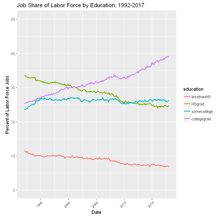
These computations stunningly corroborate the theses of the Brookings article regarding the direction of employment by education in the U.S. economy. The numbers speak forcefully: education is king. Hopefully, I’ve been at least modestly successful demonstrating the use of R to make that point. In a follow-up blog, I’ll address other R capabilities to analyze these data.