
Click to learn more about author Steve Miller.
In these highly-polarized political times, there seems no shortage of untruthful claims/boasts by the nation’s leaders. Alas, many citizens are highly credulous, blithely accepting the veracity of any statements from their tribes. At the same time, there are plenty of evidence-based skeptics who demand data before accepting “facts”. Fortunately, fact-checking political discourse is now de rigueur, and over-time politician lie tallies are routinely maintained by the press.
Count me as an evidence-demanding political skeptic. Indeed, I often take data-supporting matters into my own hands. Claims on jobs, unemployment, and GDP growth? Look them up. Boasts of super-sized stock market performance? Test the hypotheses.
The point of departure for this blog is political skepticism and a proclivity for data analysis. The good news: Fact-checking, hypotheses-testing data are ubiquitous, readily available for geeks like me. Combine a little data with a tad of computation, a pinch of stats, and a driblet of visualization — and presto, you have evidence. The remainder of this article highlights a few of my attempts at fact-checking/hypotheses testing. It’s a labor of love!
The economic time series used here are sourced from the St Louis Fed website. The stock market data are downloaded from the FTSE Russell site. The Python Pandas library deftly handles the Data Management/Data Analysis, making it easy to read, organize, and wrangle web-sourced data.
For visualizations, I use the Seaborn graphics package, “a library for making statistical graphics in Python. It is built on top of matplotlib and closely integrated with pandas data structures.” I hadn’t tested Seaborn in a while, instead generally choosing R’s ggplot interoperating with Python for basic graphics. Seaborn has progressed substantially over the last few years, however, and is now, like ggplot, quite suitable for handling the statistical challenges of Exploratory Data Analysis (EDA). Indeed, just as ggplot is closely linked to R dataframes/datatables, Seaborn is tied to Pandas dataframes. I like Seaborn a lot and look forward to continued usage/learning.
The technology used below revolves on JupyterLab 0.32.1, Anaconda Python 3.6.5, NumPy 1.14.3, Pandas 0.23.0, and Seaborn 0.9.0.
Ignore a few warnings for now.
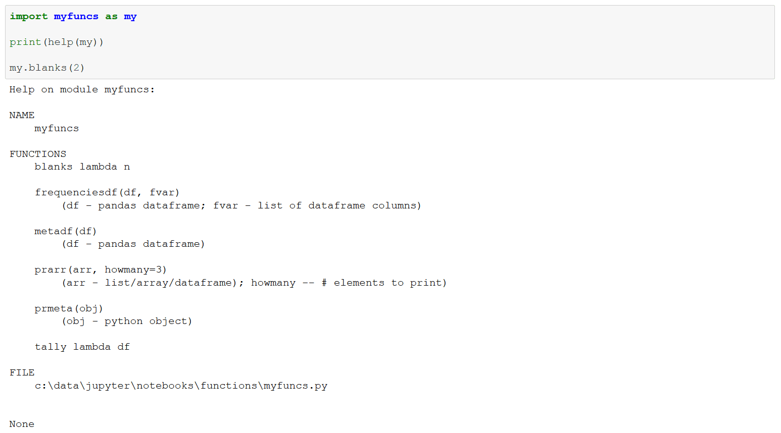
Load the personal library and document function signatures. The prmeta, prarr, and blanks functions are used in this article.
Import relevant Python libraries.
Migrate to the working directory.

Download monthly total jobs data from 1939 maintained by the St Louis Fed. Compute monthly job additions and a more appropriate end date.

Examine monthly job additions during the current POTUS’s administration.
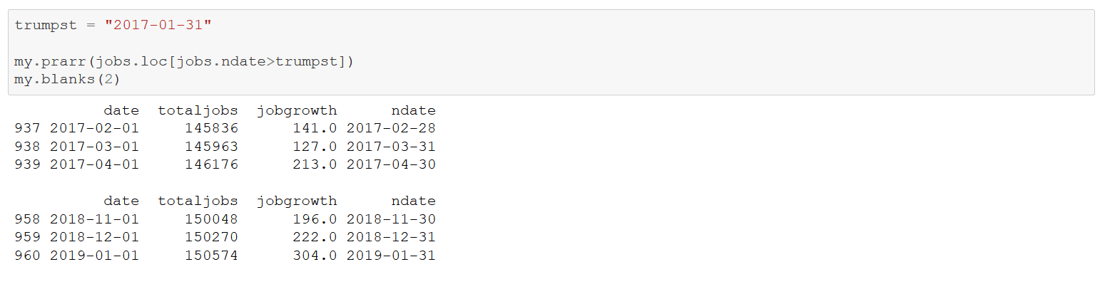
4879 new jobs over the current POTUS’s 24 months in office. Darned good!

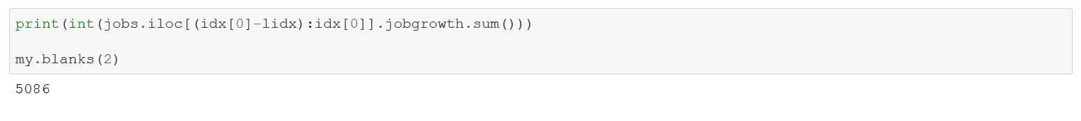
Now consider new jobs over the the final 24 months of the previous administration.

5086 new jobs over that period — even better.
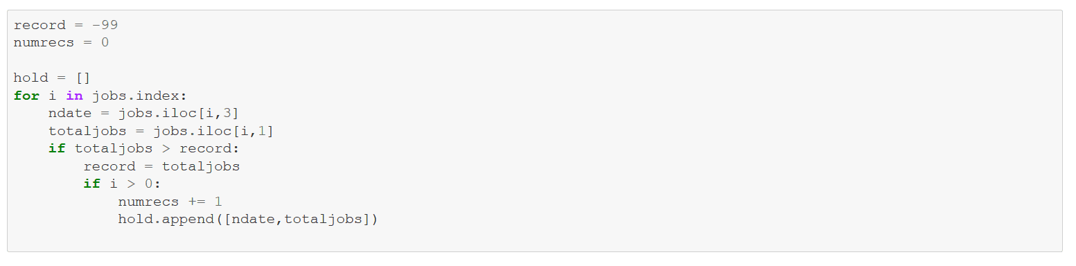
The POTUS claims the highest jobs level in U.S. history. Given a growing population, just how differentiated is a claim like that? Let’s determine how many monthly jobs “records” were set starting in 1931.
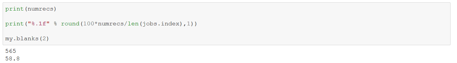
565 months — 58.8% — were records! So a new high is hardly something to crow about.
Prepare for Seaborn graphs.
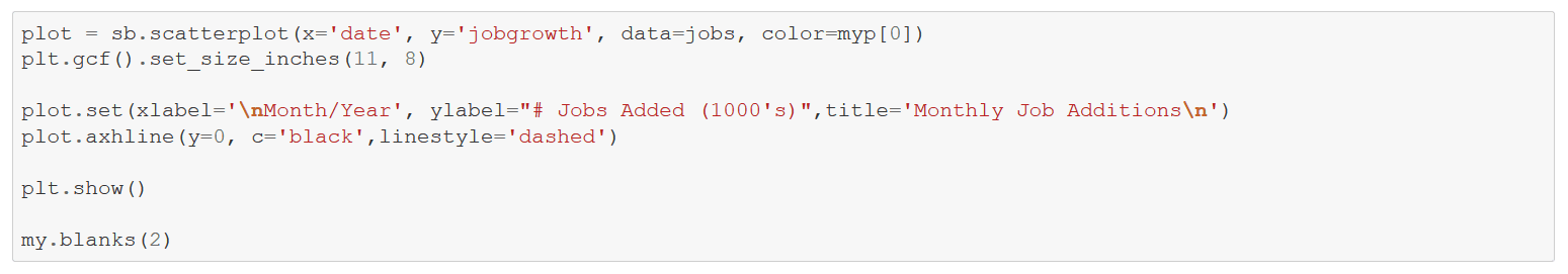
Plot total jobs by month. Easy to see the growth over time.


Now look at new jobs added by month. Note the recessions from the clustering of negative values.

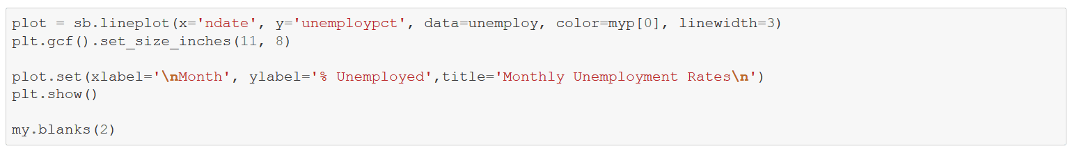
Next download monthly unemployment figures starting in 1948.

The spikey recessions stand out.

Now compare the previous administration against the current one.

The current POTUS has the better absolute unemployment numbers. An important methodological question, though, revolves on whether these figures simply represent a continuation from the previous administration — i.e. is the administration the “cause” of the decline. I’m skeptical.


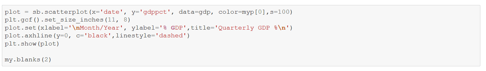
Next download quarterly gross domestic product starting in 1947.

Lots of GDP dots in this over-time scatterplot. Again, easy to spot recessions from the clustering of negative values.

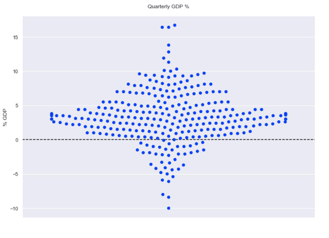
Another view of the same data absent time with a swarmplot.

Compare the current administration with the previous.

Basic scatterplot with a “president” color grouping.
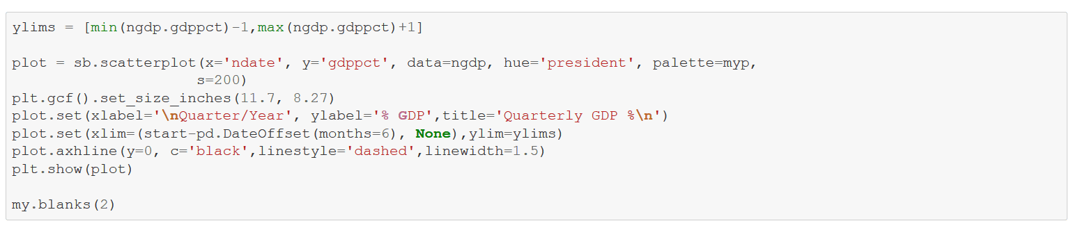
Though with a small sample size of just 7 quarters, the current POTUS has the edge in average gdppct, 2.81% vs 2.31%.

Look at the same data with a faceted plot.


A swarmplot nicely contrasts POTUS “performance”.


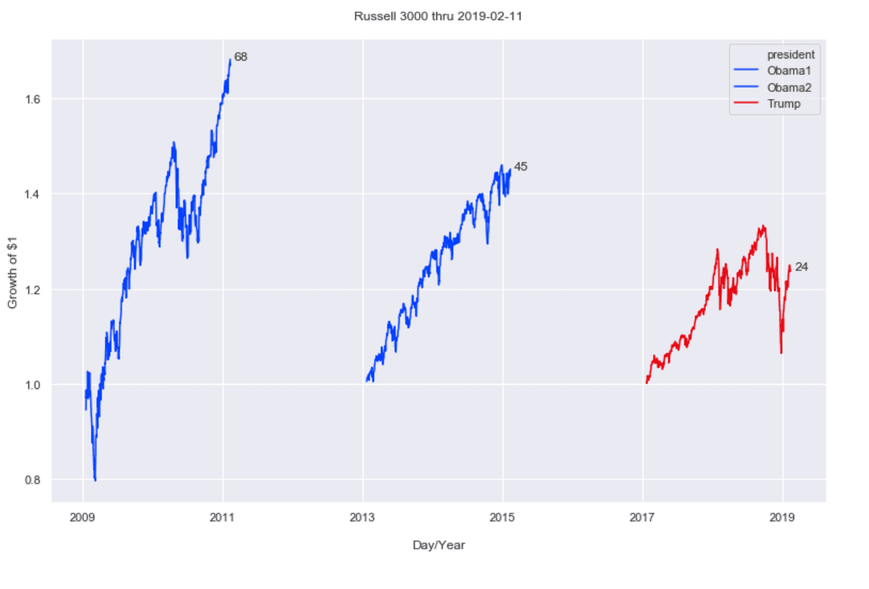
Finally, examine Russell 3000 stock market returns to contrast the first two years’ performance of the current POTUS with comparable periods of the two previous administrations.

Load the data.

Combine history and year to date.

Delete duplicate records.

Compute daily returns.
A $1 investment in 01-2005 would be worth $3.08 today (wo consideration of fees).

Assemble the data to contrast market performance under the current POTUS to those of both administrations of the previous POTUS.


Concatenate the three individual dataframes into one.

Look at the returns over the three periods — 24% for the current administration vs 68% and 45% for the two previous over comparable time periods. Not very flattering for the current POTUS.

Graph the daily returns over two years for each.

A similar view of performance against the Wilshire index built with R/ggplot.

That’s it for now. More data analysis next time!