Click to learn more about author Steve Miller.
My suburban Chicago neighbors and I were at it again, discussing politics, the economy, and the stock market at an end-of-summer barbecue. Though there’s little support for the current POTUS, the group is differentiated red from blue economically, and discussions are generally quite lively.
On the one side, they’re the laissez faire reds who wish to limit regulation and the size of government, not to mention cut taxes; on the other are the dyed in the wool Keynesians, distrustful of the invisible hand and the benevolence of corporations, who wish to widen the safety net. The reds touted the current full-throttle economy and stock market, arguing that the POTUS’s work there with tax and regulation relief was mostly on target. The blues countered that the last year and a half is little more than a continuation of the ascendance from the 2008 recession — and that we’ll soon lament the unnecessary kerosene that was poured on an august economy.
The discussion inevitably turned to the bull market of almost 10 years that the reds argue has even picked up steam recently. Both reds and blues dangerously appear to intermix the economy with the stock market, when in fact they often are quite out of lockstep. Yet both were circumspect of the POTUS’s assumption of credit for recent market successes. In the end, though, the question was whether the market has performed better with red or blue leadership over the last 35-40 years — under Reagan, Bush I, Clinton, Bush II, Obama, and Trump.
Of course, ever the data nerd, I volunteered to test the competing hypotheses, offering the Wilshire 5000 stock index as a reliable indicator of U.S. stock market performance. I found W5000 index levels dating back before 1980 from the data-trusty St. Louis Fed. I then looked up election dates of presidents from Reagan to Trump, deciding these were likely the better starting points for a stock market performance methodology that inauguration dates. The current POTUS certainly benefited from this decision, since the market advanced 9% between his election and inauguration.
Detailed below are the Growth of $1 charts for each president, followed by annualized returns for their election terms. The technology used is Jupyter Notebook and R.
With the exception of Bush II, the market has performed sterlingly for each president. The other-worldly performance under the current POTUS is limited to less than two years. Will it persist?
Define a few cosmetic functions.

Set options, load libraries, and migrate to the working directory.

Read the Wilshire text file into an array of lines and munge.

Write the result to a csv file and then read that into a data.table, calculating the date and pct change attributes. Write the data.table to an fst file.

Compute the growth of $1 for the current POTUS — 1) from the day after the election, and 2) from inauguration day. Quite a difference from $1.41 to $1.32.

The day after Obama was elected in 2008, the market went down 5.2%. The day after Trump was elected, the market was up 1.4%.

Build a data.table to use with ggplot to graph stock market performance by president.


Graph stock market activity under Reagan, Bush I, Clinton, Bush II, Obama, and Trump using ggplot2. The plots trace the performance of the markets under each president, starting with a $1 investment the day after the election and ending at the election concluding their stay in office. The dotted horizontal lines indicate the growth of $1 level at the end. Not surprisingly, the longer a president’s in office, the higher the final growth of $1 potential.


Now summarize market performance of the presidents as of close of business, 2018-08-30. Reported for each are the # years in office, the growth of an initial $1 investment over his tenure in office, and the annualized geometric mean return.
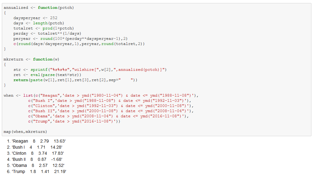
With the exception of Bush II, it’s been quite a stock market run since 1981. $1 invested in the Wilshire 5000 the day after Reagan was elected would have been worth $2.79 (minus fund fees) eight years later. The results are similar for Bush I, Clinton, and Obama. Bush II was abysmal — the $1 investment shrinking to $0.87 in eight years. The current POTUS can claim a whopping 21% annualized return, though with a short history of less than two years in office. In sum, I’d say that outside of Bush II, it’s pretty hard to differentiate the market performance of red vs blue presidents over the 1981-2018 time frame. Perhaps all are beneficiaries of the almost 40 year bull market.
What will the current POTUS’s numbers look like in 2020 or 2024? I don’t know, but as a conservative investor, I’m skeptical. 21% is certainly not sustainable. Indeed I’d be ecstatic if the 4 year numbers looked like those of Bush I. I suspect that may be asking too much. One thing’s for sure: I wouldn’t claim credit for the current performance in a long-term bull market.