
Click to learn more about author Marinella Mastrosimone.
Any front-end developer will have experienced the pleasure of opening the newly released page with the Chrome inspector and finding a clear and semantic clean code. Not even Marie Kondo could do better!
How many times have you reviewed some old code and thought, “Gosh, how bad is this? Who assigned the classes? What a mess!”At first glance, it might be the work of the nice but bungling former colleague, but Git doesn’t lie and Visual Studio quickly reveals the author: What the heck? It was me who created this obscenity!
There might be a positive side: You have improved your skills over time, and the code you write today is neater than yesterday.
When working as a team on a complex and rapidly evolving product, this individual process takes its toll: A shared nomenclature system must be adopted then.
“Tidying up should be about re-establishing a balance between people, their belongings and the house they live in.” –Marie Kondo
Teamwork
As naming things is a rare talent, adopting a naming convention helps teamwork and turns the giant question mark about how to name an object into an automatic process that follows precise rules, and that – at best – someone has defined before you.
It’s reassuring to have both a tidy closet and a uniform code, isn’t it?
“There are only two hard problems in Computer Science: cache invalidation and naming things.” –Phil Karlton
Designing an Interface Thinking in BEM
An interface designer, able to reach a good level of abstraction, may already have in mind the html structure of components while drawing them, from the draft to Figma.
After reasoning about the user experience and the aesthetic research of the interface, the designer can focus on organizing and naming the components and levels to prepare the code development process, anticipating potential development problems.
BEM provides a model that helps to reason in these terms: association between figma and BEM component = block, layer / group = element variant = identifier, works well.
Just as our cute Japanese heroine suggests organizing spaces in the simplest way possible, dividing the garments according to a logic organized by type, so also in designing a mock-up it is useful to declutter and group by sets and subsets according to a defined protocol.
It is essential to discuss with the technicians to validate feasibility and nomenclature, and with the help of the FE colleagues, to work on functional and shared solutions for this “chest of drawers” that will mainly serve them.
“Words can be bullets, but they can also be rescue teams.” –Jón Kalman Stefánsson
What Is BEM?
BEM is a convention created in 2007 (read here how it was born) to improve collaboration in front-end development.
Thanks to BEM, we are able to assign to the classes of our DOM elements names that are explicit about the type and hierarchy of their content:
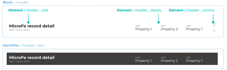
Block is the main container that contains a set of other elements, even at multiple nesting levels: our “chest of drawers,” to clarify
Element is the child of the block and distinguishes each of the main sections that contain other elements: the “box that divides the socks,” simply
Identifier is an indicator that changes the appearance of the block or element, as if the labels of the containers transform the shirts into wool sweaters
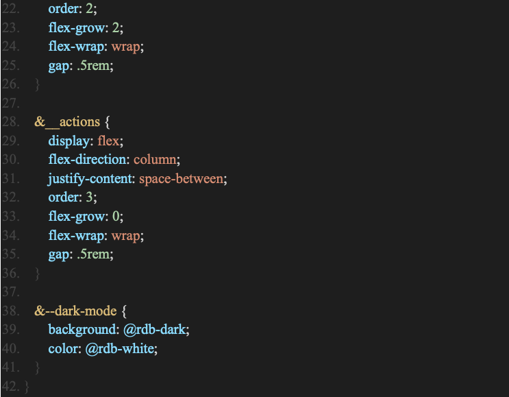
An example: l-header, a component of our design system, has an intrinsic structure that can contain strings, objects, or other independent components.
Robust CSS Architecture
At our company, we have chosen BEM as the reference model among the many conventions available (OOCSS, SMACSS, SUITCSS, Atomic) because its peculiarities are perfectly adaptable to the needs of a design system:
Clear Structure
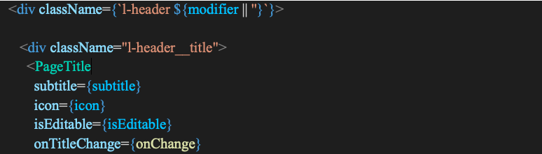
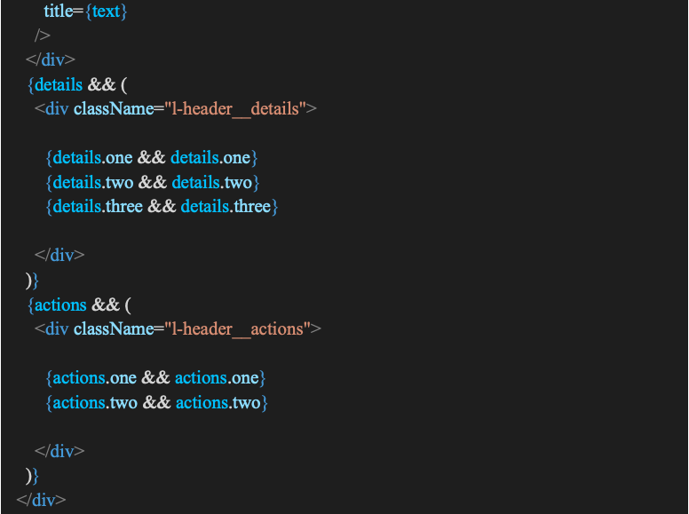
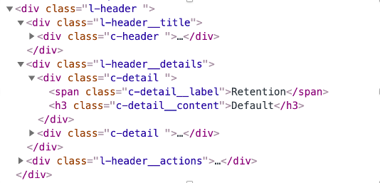
Having semantics similar to the React structure allows us to think in terms of components: Each component is an easy block to intercept and recognize within the project also in the compiled html. Here is the l-header compiled. Isn’t it beautiful?
Modularity
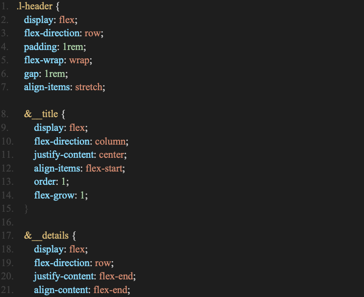
Each block is made up of distinct units, each performing a specific task and capable of interacting with the others, or being used in different patterns.
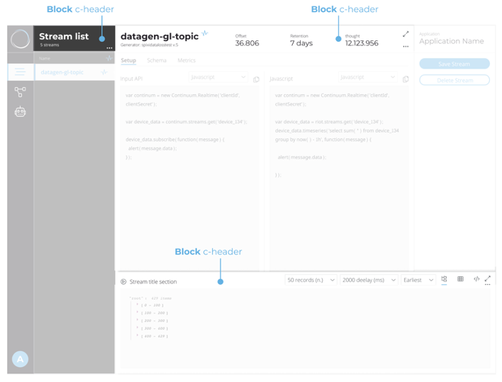
Below is our l-header used in various sections of the RNA interface, our MLOps Platform.
Reusability
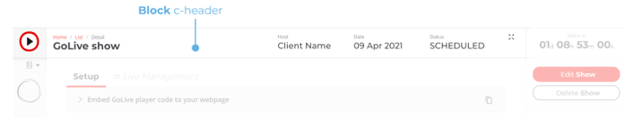
Each component, while maintaining its properties, can change shape or color to match its parent or its identifier. This is how our l-header changes its appearance based on context and content. In this case the product has the structure of our design system but in light mode and with a different primary color in the product GoLive.
ABEM: A Useful Adaptation of BEM
Distinguishing a room from a wardrobe and a wardrobe from a drawer is natural when we tidy up our house. When it comes to a design system, things become more complicated.
Fortunately, some specificities of our method come to the rescue.
The code shared so far has one more module than the Block_element-identifier, in fact a more recent declination called ABEM (*) allows us a further classification and greater flexibility.
A (tomic) BEM defines the type of block with a prefix of a single letter, while the classes atomic allows the use of global styles, limiting the known problem of stiffness of the original system.
Our pure BEM React component could have looked like this:

Instead, we have chosen to free the modifier class from the constraint of the containing block.

In this way, we can also dynamically manage state classes or helpers better described below.
Selector Specificity
The ABEM structure is extremely interesting thanks to the openness of the atomic classes, but it’s not close enough to the desired solution. For our structure it is ideal to use the self explanatory nomenclature prefix as suggested in this article.
We can distinguish the type of block in order to recognize the genre of our selector:
- Module layout l- l-header l -sidebar l-modal
These modules have no aesthetic elements and are used exclusively to position components and structure the layout of an application.
- Component c- c-toolbox c-detail c-tab c-button
They form the backbone of an application and contain all the features for a standalone component. - Helpers h- h-show h-hide
These utility classes have a single function (and are commonly used for positioning or visibility). - States is- has- is-visible has-loaded
Indicates the different states a c component can have.
Semantics
Now that you can give your React project a neat style, do you think you can avoid wondering if the element you are using is a title, paragraph, label, or list? Chill out!
Classifying each object of the dom according to our model does not relieve us from the need to maintain correct semantics in the html by assigning the appropriate tag to the content type, as the style-free page must maintain correct accessibility – for example, for automatic code reading systems useful for the blind people and google algorithms, among others.
Naming Consistency
The hardest task of all: naming objects so that they are generic enough to be modular, while maintaining the descriptive ability of their content.

Do you really want to call “c-consumptions” the bar chart block that shows the consumptions in the table? Indeed, you are creating this new component to show customers’ consumption, but this same component could be useful, for example, to visualize the efficiency detail of a service in another environment where the name could be misleading. So let’s call it “c-chart-micro” in order to have a wider level of granularity and, possibly, make the chart an interchangeable component, with a chart area or a small pie chart.
“Nomen omen (a name, a destiny)”
Spring Cleaning the Codebase
As every April in the domestic habits of many households, it’s time for “spring cleaning”: At our company, we are giving a refresh to the design system, creating new design patterns, renewing the existing ones, and getting rid of those that did not “give us joy.”
Recently, we have also started putting a big effort on moving our front-end architecture towards a “micro-front-end” approach. Want to hear more? Stay tuned.