Analytics uses the scientific method where an analyst makes hypotheses and uses the analytics tools to test their premises.
Analytics, is described as:
“[An] encompassing and multidimensional field that uses mathematics, statistics, predictive modeling and machine-learning techniques to find meaningful patterns and knowledge in recorded data.”
Analytics is often broken down into three components:
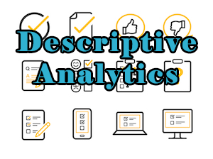
- Descriptive Analytics: Covers the more standard BI activities aimed at understanding activities and opportunities from historical data. It answers the questions:
- What happened?
- Why did it happen?
- Predictive Analytics: Provides insight based on modeling. It answers the question: What is likely to happen? It is sometimes considered a subfield of supervised learning that is rooted in statistics.
- Prescriptive Analytics: Has its basis in scenarios and asks: What should we do to make things happen? It takes predictive analytics a step further to define actions that will affect outcomes, rather than just predicting the outcomes from actions that have occurred.
Analytics in Action
Learn key analytics and machine learning techniques to formulate and solve business problems.

Other Definitions of Analytics Include:
- A “catch-all term for a variety of different business intelligence (BI)- and application- related initiatives. For some, it is the process of analyzing information from a domain, such as website analytics. For others, it is applying the breadth of BI capabilities to a specific content area (for example, sales, service, supply chain and so on).” (Gartner)
- “A qualitative aspect to decision-making, provided by the algorithm and derived from identified patterns among the data.” (O’Neal and Ladley)
- “Diagnosis, predictions and opportunities made from high-speed and high-volume data.” (Paramita Ghosh)
- Techniques “designed to parse, explore and produce results to support business decisions.” (Kartik Patel)
- “An enabler to derive truth and meaning from data that drives business growth.” (Forbes)
- “Tools and techniques used by many different industries to create, manage [and explore] large, complex datasets, to evaluate past performance, predict future trends, and make better decisions.” (Washington State University)
Businesses Use Analytics To:
- Find and act on business opportunities that may be discovered through datasets.
- Improve process.
- Grow revenue.
- Be proactive on risk management.
- Derive a competitive advantage.
- Develop new services.
Photo Credit: Shutterstock.com