Data visualization describes the shape of information formed in a graph depicting a particular context. Data visualizations contain contextual information (the metadata) and the actual data, making the information more straightforward for people to process and analyze.
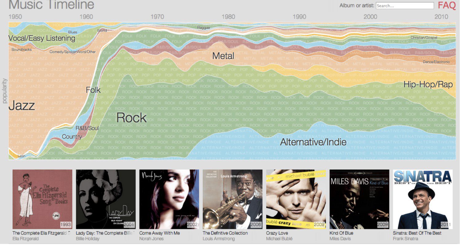
According to DAMA-DMBoK2, data visualizations cover traditional BI tools like “tables, pie charts, line charts, area charts, bar charts, histograms, turnkey box (candlestick).” Users may access data visualization in a static format, like a report or a more interactive online form, like a that they can drill down. Google Research’s Music Timeline is an example of an online data visualization.
Anthony Unwin, at MIT, identifies data visualization as a useful tool:
“For data cleaning, exploring data structure, detecting outliers and unusual groups, identifying trends and clusters, spotting local patterns, evaluating modeling output, and presenting results.”
Sometimes data visualizations provide the best way to handle complex information. For example, Google’s graphics show how jazz grew in popularity between 2000 and 2010.

Other Definitions Data Visualization Include:
- “A technique of presenting information in a visual way, such as in a map or graph.” (Gilad David Maayan)
- “An image that displays data in a structured and ordered format, easy to interpret, and meaningful for decision-making.” (Vaibhav Shah)
- “A way to represent information graphically, highlighting patterns and trends in data, and helping the reader to achieve quick insights.” (Gartner Glossary)
- “A graph to show data.” (MIT)
Data Visualization Examples Include:
- CoVER: A coronavirus emergency response platform that displays COVID-19 outbreaks and predicts the spread
- Tours, a digital travel planning tool that enables users to create affordable multi-stop trips
- An augmented reality tool that helps doctors do challenging surgical procedures
- A path of a hurricane displayed through Weather Underground
Businesses Require Data Visualization to:
- Process information quicker
- Make data available
- Identify process improvements
- Lower costs
- Summarize information
Image used under license from Shutterstock.com


