Click to learn more about author Steve Miller.
I’m often asked about the skillsets of top analytics professionals/Data Scientists. My response is always a deep background in statistics and Machine Learning in addition to strong capabilities in Data Management and computation. On the less technical side is knowledge of the business (or other) environment plus the ability to weave stories with analytics and visualizations. Finally is a healthy dose of skepticism that encourages tough “prove it” questions along with the use of clever methods/designs/data to help tease out cause and effect from simple correlations.
This skepticism is often the most challenging aspect of the role. And Data Science programs are now recognizing this critical component, offering courses in research design as part of their core curriculum.
The platinum standard for skeptical methods is the experiment in which “subjects” are randomly assigned to treatment groups and responses to a measurement device subsequently compared. If the randomized experiment is executed properly, significant differences in group measurements can, within chance, reasonably be attributed to the treatments – thereby elevating correlation to causality. With the well-designed experiment, “other things” are indeed equal.
Even in the absence of randomization, clever designs can often be deployed to help tease out cause and effect. One such design consists of a time series of measurements taken over multiple groups where random assignment isn’t feasible. A marketing campaign that introduces a new sales approach to one region but not another, then contrasts weekly revenue between regions, is one such example. The “control” group and multiple data points help “protect” from spurious interpretations.
Nowhere is the need for skepticism more critical than it is for “evidence” surrounding the efficacy of government initiatives, especially in the hyper-partisan environment of today. Both blues and reds are quick to interpret “data” to best support their party’s interests, ignoring critical contextual considerations. Alas, in the political world, other things are almost never equal.
I was particularly struck recently by several articles that appeared in the news media touting the performance of the economy. Just last week, the number of job additions for December 2017 was released. At 148,000, that number was good, if a bit less than expected. The Washington Post correctly noted that the first year job additions and drop in unemployment rates for the current POTUS exceeded the comparable first year numbers of most recent presidents, and dwarfed those of president Obama in 2009: “Relative to Obama’s first year in office, Trump’s was consistently very good. For example, in the number of jobs created or lost over the year: Under Trump, there were 1.8 million more people working in December than in January. Under Obama, 4.3 million fewer.”
Only later does the author acknowledge that at the start of 2009, the U.S. economy was already deeply in the throes of an almost-depression, whereas the current economy is on cruise control. For the skeptic like me, that additional bit of context is the much more significant calibrating factor.
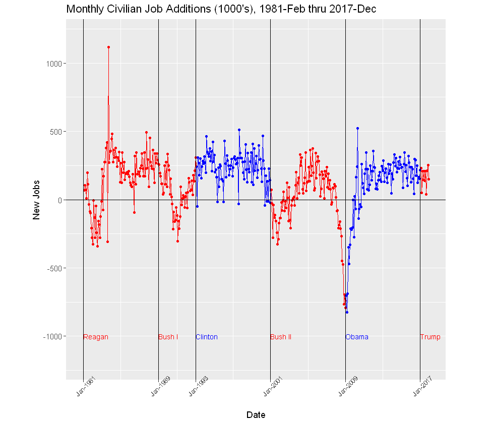
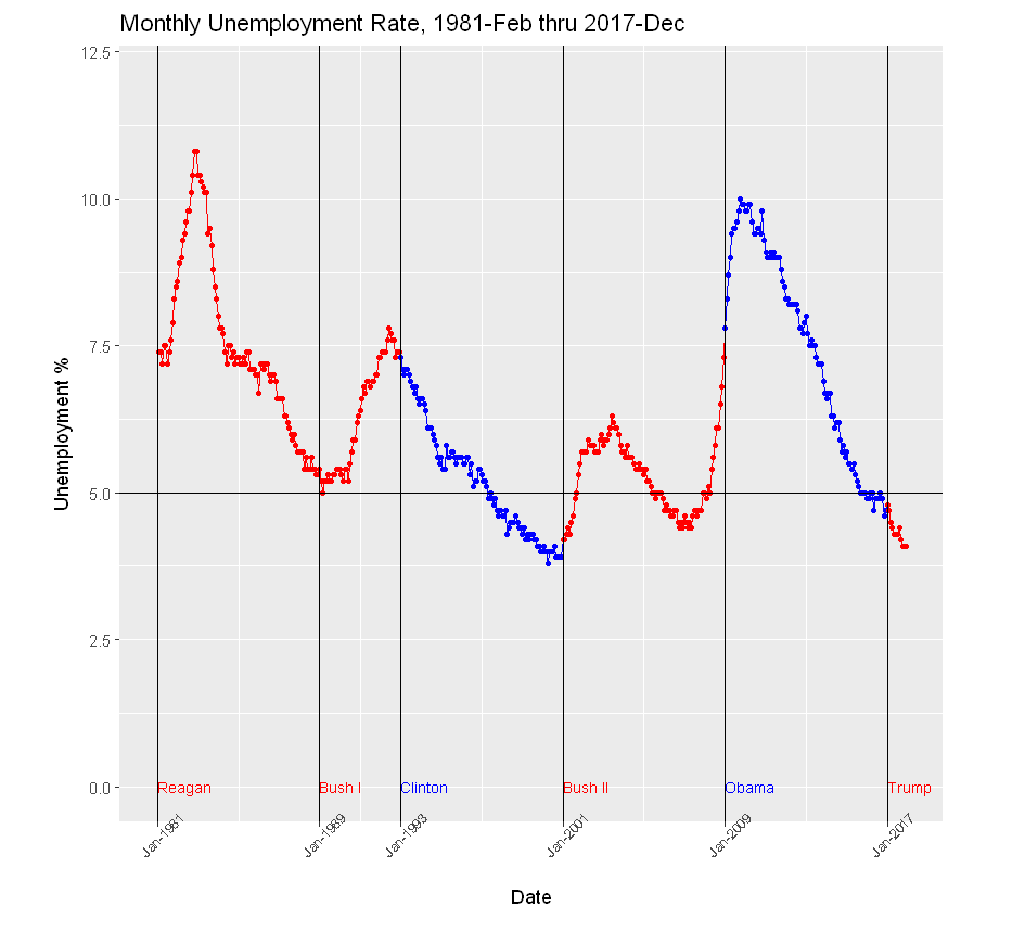
So I decided to take a look at some numbers, gathering new jobs and unemployment time series data readily accessible from the St Louis Fed. I then loaded the data into R, created a few variables pertaining to who occupied the presidency, and prepared several visuals in R. I looked at both new jobs and unemployment dating back to Jan 1981, when Ronald Reagan took office. I then examined monthly job additions and unemployment by president and party. I do not include the R code behind the visuals.
In the Civilian Job Additions graph below, the points from the first year under Trump seem much like those from the Obama administration years following a period of climbing out of a recession hole. Indeed, the last 7 years of job additions, 6 under Obama, and 1 under Trump are thus:
year new jobs
2011 2091
2012 2142
2013 2302
2014 2998
2015 2713
2016 2240
2017 2055
To this skeptic, a much more cogent interpretation of recent data is not just as a good first year by the Trump administration (though a bit under the 2011-2016 average), but perhaps more importantly, a continuation in 2017 of the significant progress by the Obama presidency in 2011-2016, following two horrible years of inherited recession.
Similarly, rather than seeing the lowest the percentages for a first year president in decades, the skeptic might interpret the benign unemployment rates in the context of six years of decline that immediately preceded. Yes, the current figures are impressive, but they’re simply in trend with the longer term movement. If Obama were still in office, the numbers would probably look just like these.
Note that in both graphs (and without any context), the Clinton administration “wins” hands-down.
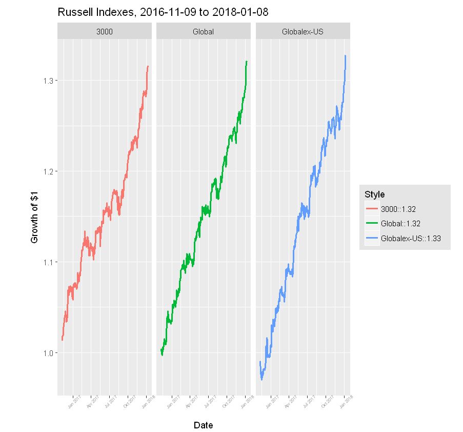
Now consider the stock market performance from election day 2016 to 2018-01-08. In that 14 month period, the Russell 3000, an index of the broad U.S. economy, has increased 32%. Wish I’d invested in a 3000 ETF on 2016-11-08! Not surprisingly, the POTUS takes credit for the surge.
But let’s take a closer look. Over that 14 months, the Russell Global index of world companies has also increased 32%. And, more significantly, the Global except U.S. index has grown 33%! So a pretty strong case can be made we’ve been riding a global wave for over a year. Of course, I suppose one could argue that the election of the POTUS lifted boats for companies around the world. I’m skeptical!
For me, this is proof again that context is critical: without experimental manipulation, other things cannot be considered equal, so the skeptic must challenge easy explanations of cause and effect – and bring additional data to bear.
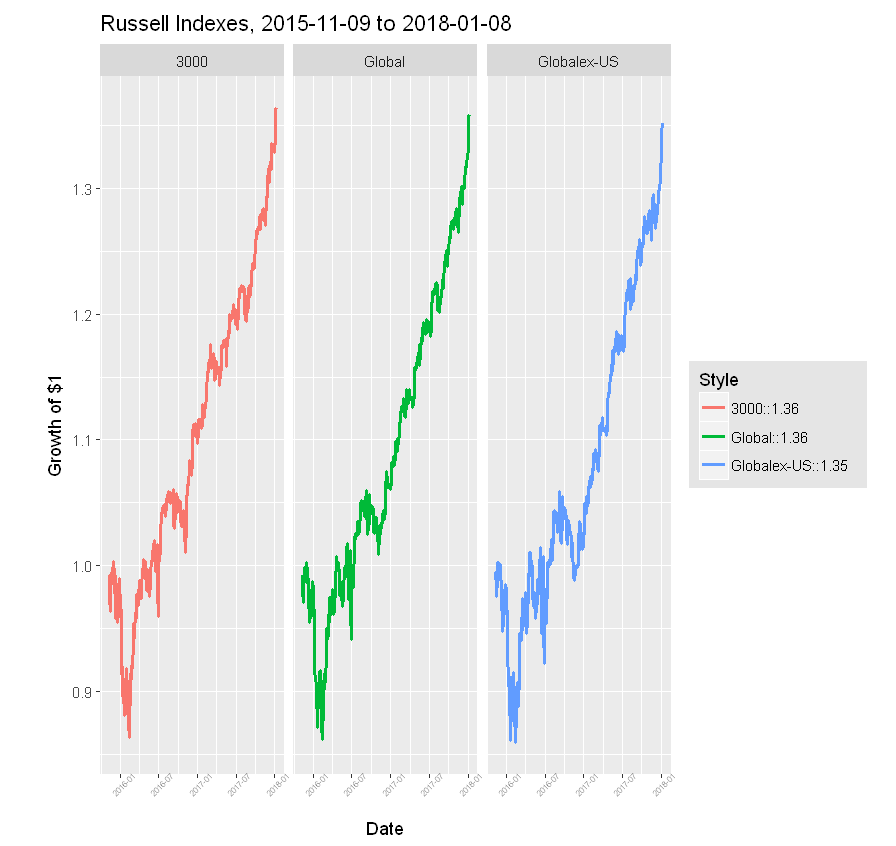
Finally, let’s include another year to the stock market performance data. Though these 12 months add little to individual index performance, they offer further evidence the indexes are moving in lock step over this period.
In the absence of experimental control, the Data Scientist should be ever skeptical, challenging explanations of correlations as cause and effect. Methods, designs, and data that help interpret context are critical to answering analytics questions. The Data Scientist must strive to understand contexts surrounding her data, so that ultimately she’s comfortable that “other things are equal”.