
Have you ever heard the saying, “A picture is worth 1,000 words”? This statement holds especially true in the field of Data Science. Let’s say you are a data scientist at a top Fortune company, dealing with budget portfolio optimizations worth millions of dollars annually for various clients. It is essential to effectively communicate your findings to clients or stakeholders to make an impact. This is where data visualization comes in.
Data visualization is the process of creating visual representations of data to convey information and insights more effectively. It allows you to quickly identify patterns, trends, and outliers that may not be immediately apparent in a table or spreadsheet. By using graphs, charts, and other visual aids, you can present complex data in a way that is easy to understand, even for those without a technical background.
This is crucial when presenting findings to stakeholders or other members of your team who may not be familiar with the intricacies of your analysis. In addition to making data more digestible, data visualization can help you identify errors or inconsistencies in your data.
By visualizing your data, you may notice patterns or outliers that you would have otherwise missed. Overall, data visualization is a powerful tool in the Data Science toolkit. It allows you to communicate your findings more effectively, identify patterns and outliers, and ultimately make better decisions based on your data.
Additionally, data visualization plays a crucial role in the process of data EDA, or exploratory data analysis. By presenting data in a visual format, patterns and trends can be quickly identified and insights can be gleaned from the data. This helps to make sense of complex data sets and can lead to more informed decision-making. Without effective data visualization, it can be difficult to fully understand the meaning behind the data, and valuable insights may be missed. Overall, data visualization is an integral part of the data EDA process and is essential for effectively analyzing and interpreting data.
Let’s take an example of housing price data along with factors that can impact its pricing [1], to understand how visualization can make your data speak. Below are some visualization plots that help portray meaningful insights.
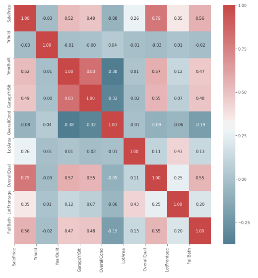
Correlation Matrices
Let’s say you want to know which factors have a similar impact on the pricing of a house, or simply which factors are correlated. The colored correlation matrix in Figure 1 gives you an overview of the correlation between various factors, and you can make the following inferences with just a glance:
- Year Built and Garage Year Built have an 83% correlation, as most people build their garages along with their houses.
- Sale Price and Overall Quality have a 79% correlation, as a better-quality house will usually command a higher price.
- Year Built and Overall Condition have a negative correlation of -0.38, as the condition of a house deteriorates with each passing year.
Count Plots
What if you want to know the pricing distribution by neighborhood? If you were to describe it verbally, it would be extremely difficult to retain the various numerical metrics, such as mean price, variance of price, etc., for each neighborhood. However, if you use a count plot, as in Figure 2, you can directly infer all the distribution data and compare the neighborhoods, all at one go.
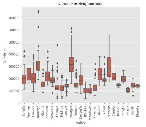
You can tell from the figure which areas often experience higher sale prices and which areas typically experience lower sale prices. This enables you to determine the quality of the community. Additionally, you can see that the neighborhood’s mean sale price shows a significant amount of variation.
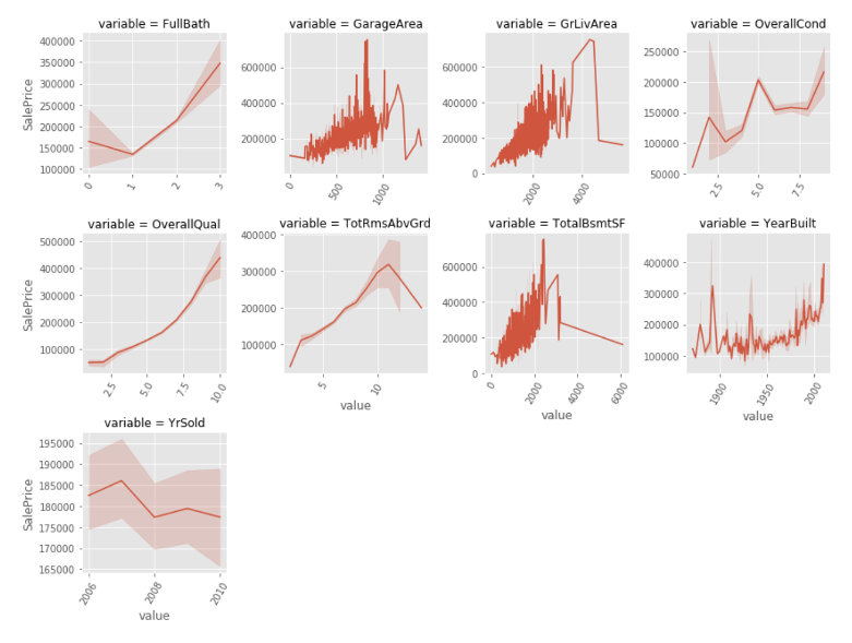
Line Plots
Now, if you want to understand the sales price trends over the years, and what factors may have contributed to them, you can refer to Figure 3.
- The line plots show that the sales price has decreased over time, which indicates that the market has not been doing well.
- Additionally, you can observe that if a home’s basement area is excessively large, the price of the home tends to be quite low. This may be because it is considered poorly constructed.
- You can observe that overall quality and condition are directly correlated with sales price, as was previously expected.
- It’s interesting to note that prices for homes constructed before 1900 are greater than those constructed later; this could be because of the homes’ historical importance.
All these insights – deduced from the plots with just a glance – would otherwise have been difficult to extract based on numerical or verbal information.
Factor Plots
When multiple response and factor variables are plotted together, the resulting plot is called a factor plot. Any type of univariate or bivariate plot can be used as the basis for the underlying graphic. Let’s say you want to provide a timeline of housing construction in a community and also show the evolution of housing style over time. To communicate this in a textual manner, you would have to provide a detailed list or table, along with descriptions. However, in Figure 4, you can observe all the information in a single plot, along with additional insights.
The plot displays the year that houses were built, as well as the neighborhood in which they were built and the sort of houses that were constructed. It is clear that the oldest neighborhood in town was called Old Town. You can also see when the neighborhoods progressively developed, as well as the fact that some communities developed in a very quick amount of time. You may also notice that the majority of buildings with two stories were constructed after the 1980s.

All these samples help make clear the importance of a good visual and how you can effectively convey insights with visual representations.
Challenges of Data Visualization
However, it’s not always easy to visualize a given dataset. When it comes to data visualization in Data Science, there are several challenges that professionals in this field face. One of the main challenges is the sheer amount of data that needs to be analyzed and presented in a meaningful way. With so much data to work with, it can be difficult to know where to start and how to identify the most important insights.
Another challenge is choosing the right visualizations to represent the data. Different types of data require different types of visualizations, and it can be a challenge to determine which type of visualization will be most effective for a particular dataset. Additionally, creating visualizations that are accurate and easy for non-technical users to understand can be difficult.
Finally, ensuring the accuracy and reliability of data visualizations can be a challenge. It’s important to be diligent in checking and double-checking data to make sure that the visualizations accurately represent the information they are meant to convey. With these challenges in mind, data scientists must be meticulous in their approach to data visualization, in order to create useful and effective visualizations that can inform decision-making and drive business success.
[1] Thain, Tom. House Prices – Advanced Regression Techniques. Kaggle.