With the analytics work I’ve been involved with over the last 15 years, I estimate that 70% of the effort has been devoted to data access/integration/wrangling/curation, about 20% focused on data exploration, and the remaining 10% fitting algorithms/models. SQL and the open source platforms R and Python have been primary computation platforms, and now provide strong coverage for all angles of the analytics process — data integration, exploration, and modeling.
Though my analytics company, Inquidia Consulting, has defining expertise in data integration, my favorite area is exploration — the attempt to preliminarily discern patterns in data using statistical visualizations and simple summarizations such as frequencies and order statistics. Often, such work provides justification and direction for modelling efforts to follow.
This blog is the first of a multi-part series to share a few exploratory techniques I’ve found useful in recent work, though it’s not intended to be a comprehensive explication of data exploration. The code below is in R, and uses the data.table package, as well as Hadley Wickham’s splendid ggplot2 graphics and tidyverse programming libraries.
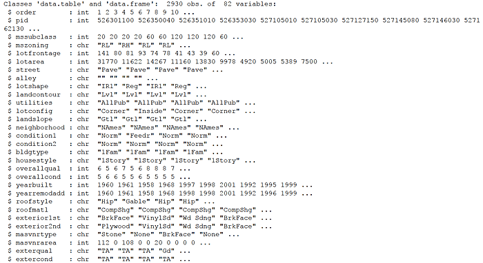
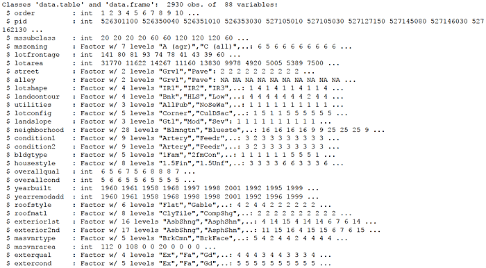
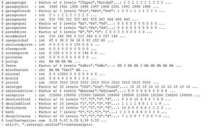
The data investigated, Ames Iowa Housing Data, was assembled by an Iowa State University professor for an applied regression analysis course he teaches. “The data set contains 2930 observations and a large number of explanatory variables (23 nominal, 23 ordinal, 14 discrete, and 20 continuous) involved in assessing home values.”
The objective with this data is to predict saleprice of a house/townhome/condo as a function of housing attributes or features. With saleprice a continuous numeric target, the challenge is one of regression. We wish to explore the direction/strength of relationships between the features, which may be either numeric or categorical, with numeric saleprice. Several exploratory techniques are demonstrated below.
Let’s get started.
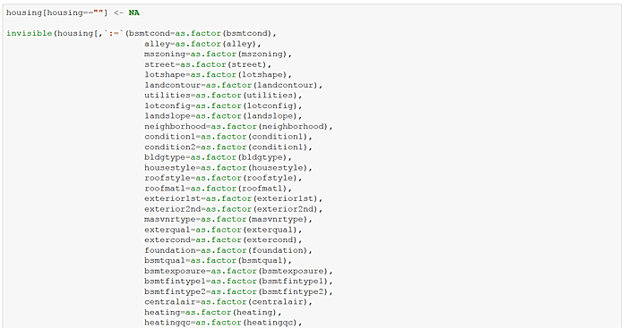
First, set a few options, load some packages, and identify the file to be loaded from a data website. Read the data into an R data.table named housing.

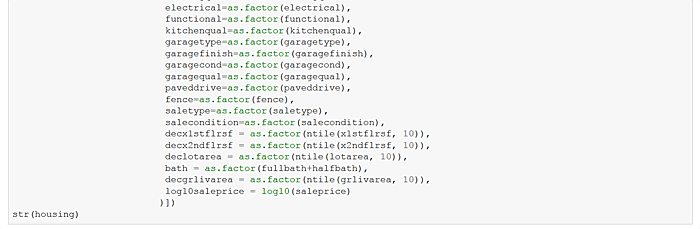
Update the housing data.table to set blanks values to NA and make factors/categories of recurring-value character variables. Add a log sale price variable. Finally, create additional decile “bin” attributes for several continuous variables such as above ground living area, “grlivarea”. I can hear my old stats professors gasping!

Now randomly apportion housing into housing_train and housing_test data.tables with 70 and 30 percent of records respectively. Henceforth we use only housing_train to explore, avoiding the pitfalls of snooping.

2051 88
Define a generic frequencies function and exercise it on several housing_train features.
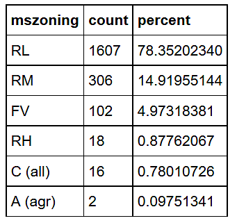
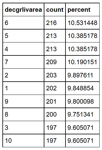
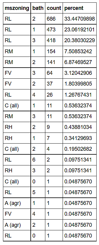
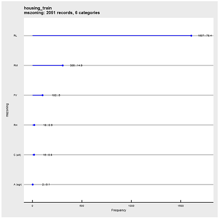
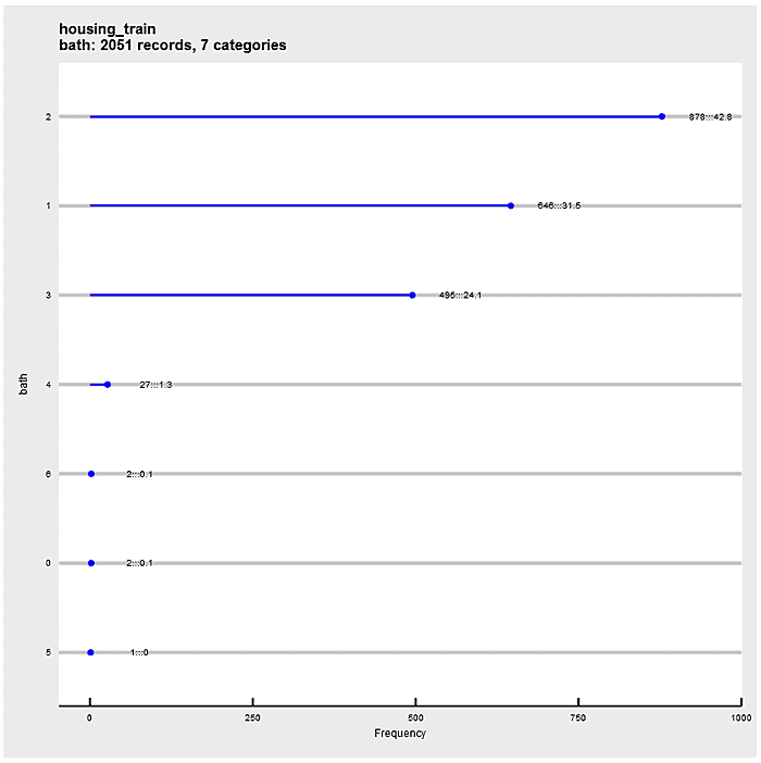
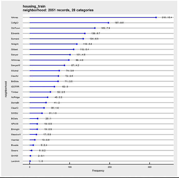
Define a ggplot2 function that “dot plots” attribute frequencies from largest to smallest. The graphs include text frequency counts and percentages. Exercise the function on attributes “mszoning”, “bath”, and “neighborhood”.
![]()
![]()
![]()
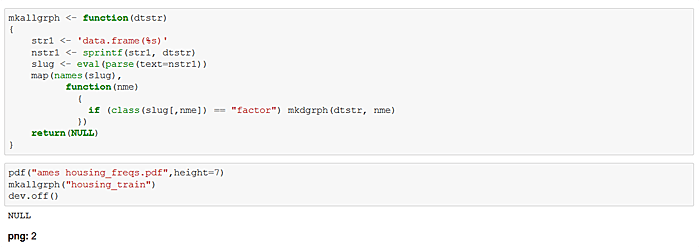
Define a function to generate graphical frequencies of all factor variables in the housing_train data set. Execute the function and produce a pdf file with the results. This output is my point of departure for exploration. Note that similar generating functions can be used to “loop” over numerical attributes.
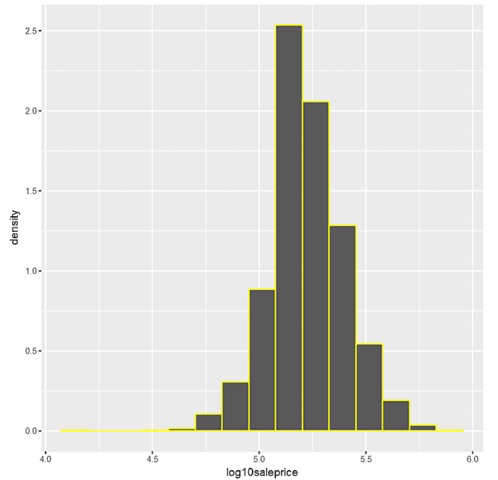
Just as frequency plots are central to factor attributes, so are histograms to numerical variables. Let’s look at a histogram of main depvar “log10saleprice” with 15 categories or bins.


Next do a similar graph with a density histogram where the area under the curve should be seen as summing to 1.

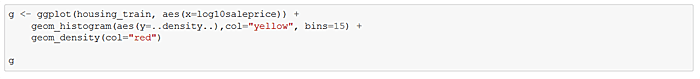
Now superimpose a smoothed kernel density plot over the the density histogram.

Finally, note how the histogram and kernel densities begin to converge as the bin size gets smaller (and the number of bins gets larger). This isn’t serendipity.

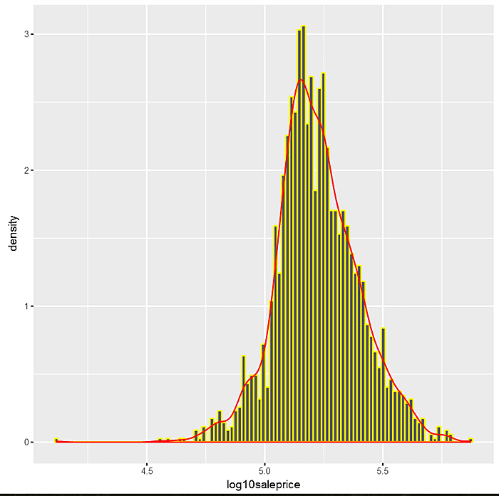
The net-net is that we can use the kernel density curve alone to depict the distribution of numeric variables with the area under the curve equal to 1. Coupling kernel densities with the trellis or facteting capabilities of ggplot2 lets the analyst explore relationships between factor independent and numeric dependent variables.
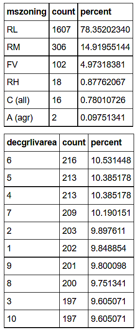
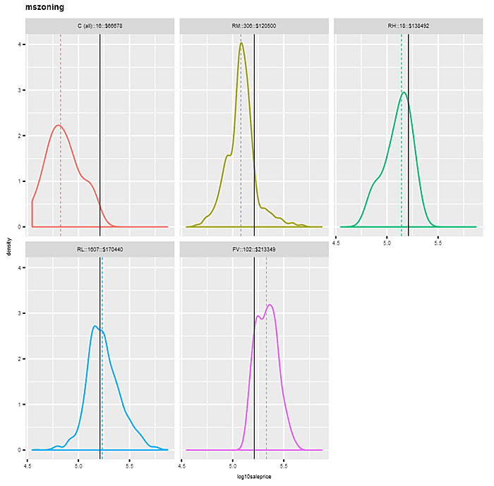
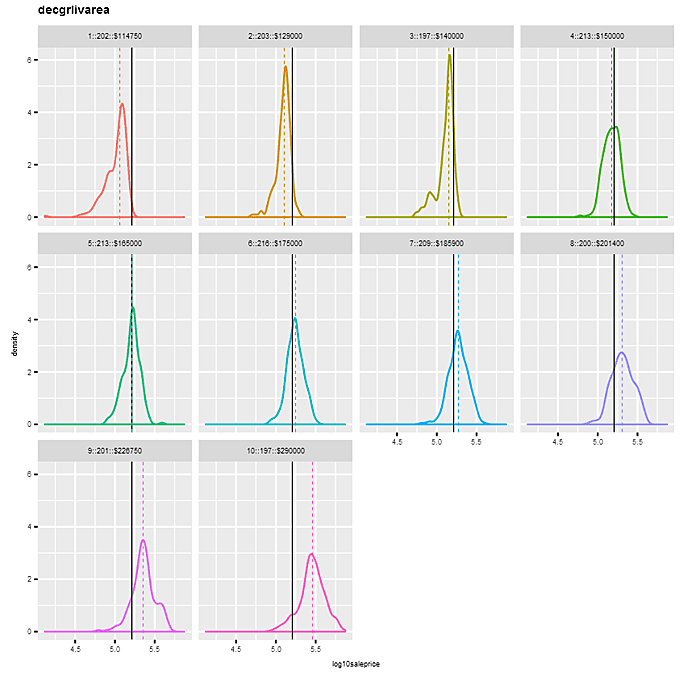
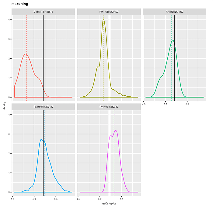
Let’s take a look at faceted kernel density plots of “log10saleprice”, first by factor “mszoning”, and then by binned variable “decgrlivarea”. For “mszoning”, we omit the category “A (agr)”, which has a frequency of just 2. The plots sort the panels left to right, top to bottom by median sale price for each factor category. Each panel’s density has a different color, with the overall median “log10saleprice” depicted by an identical vertical solid line in each panel, and the individual category medians indicated by dashed colors. Notice how the density distributions shift in a positive direction as panels proceed along categories left to right, top to bottom.
In the “mszoning” example, the differences in the density distributions by category are pretty pronounced — starting at the “C (all)” level with 16 observations and a median sale price of $66,678, to “FV” with 102 observations and a median sale price of $213,349. This would suggest a pretty strong relationship between “saleprice” (and hence “log10saleprice”) and “mszoning”.
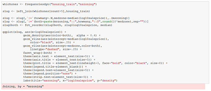
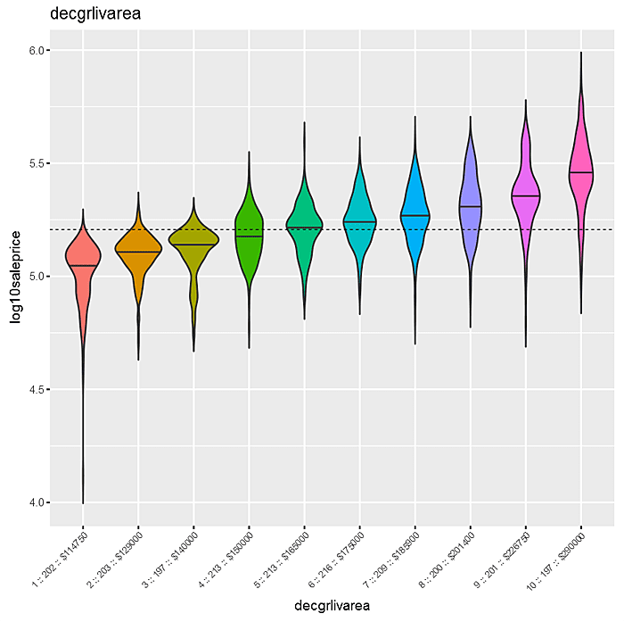
The findings are similar for the binned attribute “decgrlivarea”, indicating a positive relationship between “grlivgarea” and “log10saleprice”. Of course, in this case we could have shown the relationship in a simple scatterplot, but binning can be helpful when data size is large.
![]()
We define a function that produces the graphs with much less angst than the above repeated cell code. And, of course, we can easily define a function (and do at the end) to invoke mkdens for each factor attribute in a data.table.

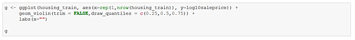
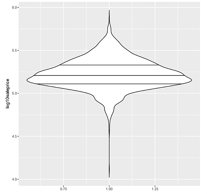
The trellised kernel density plots for factor variables against “log10saleprice” are quite useful, but ggpot2 also provides a “violin” plot which is a mixture of a kernel density and the older boxplot. Consider first the violin for “log10saleprice” in aggregate. The area under the curve is 1, so the girth indicates frequencies. The median, 75% and 25% “log10saleprice” are also denoted as horizontal lines.
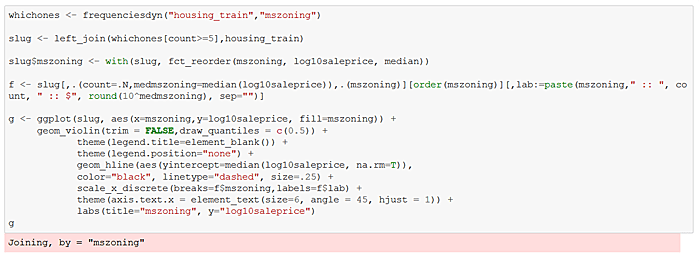
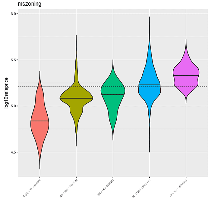
Next consider the violin plot “log10saleprice” against “mszoning”. The distributions of “log10saleprice” by “mszoning” are denoted left to right ordered by median “log10saleprice” for each category. The overall median “log10saleprice” is indicated by the dashed black line, while individual “mszoning” level medians are solid black within each violin. Not surprisingly, as with the kernel density plot, this graph suggests a pretty strong relationship between “mszoning” and “log10saleprice”.
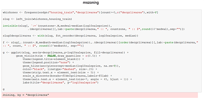
Ditto for the plot that follows between “decgrlivarea” and “log10saleprice”.
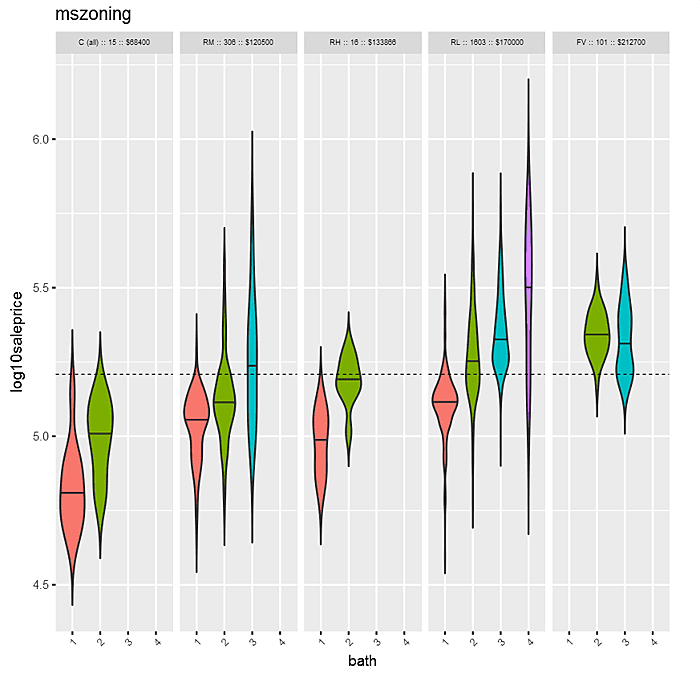
In contrast to density plots, with the violin plot, it’s easier to expand from one dimension to two. In the following example, the factors are “mszoning” and “bath”. Within each “mszoning” panel are violins of “bath”. The panels are sorted by median “saleprice” for each “mszoning” category. Within each panel, violins are sorted by “bath”.
Last but not least, density plots of “log10saleprice” for each data.table factor can be generated with the function below. A similar wrapper could be readily defined for violin plots.


That’s it for now. We’ll examine more exploratory techniques in a subsequent column.