 It’s now 2016 and to ring in the New Year with some good news – and with an enjoyable Data Visualization focus – we decided to publish this Happy Data New Year post from the Data Visualization blog Visual Cinnamon. Created by Nadieh Bremer, an Astronomer who became a Data Scientist, Visual Cinnamon is a site filled with Data Visualizations that she says “include both web-based interactive visualizations, using Storytelling to show insights into complex data and static visualizations that typically allow a bit more freedom in their design.”
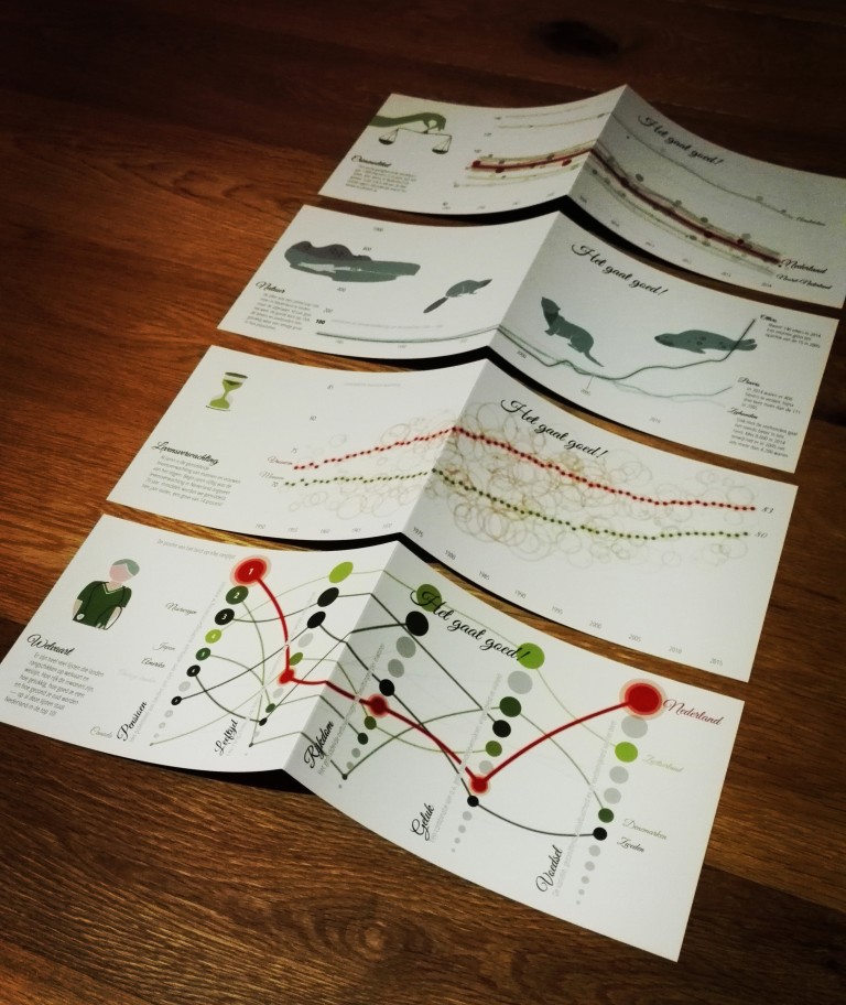
In her Happy New Year post she created actual Christmas cards that are visualizations on “positive things.” For example, “The nature subject revolves around the increase in populations of the otter (which had completely disappeared from the Netherlands for a few years), beaver and seal. Sterre had created such lovely designs for each of these animals that I wanted to create a very simple chart so her designs could be featured prominently. So it’s just three simple line charts. To make it slightly more visually attractive I added another set of lines below that were thicker but had a very low opacity. Due to the different numbers of population for the three species, otters are at 400 while seals are at 8600 in 2014, Stephan had already delivered the data in indexed numbers as well, using 2005 as the baseline (i.e. as 100). The main point was to show a growing population so the indexed data worked better.”
She also created visualizations on prosperity in the Netherlands, “this subject actually took the longest to create, because it was all handmade, not a shred of code was used. Stephan found some very interesting articles of country rankings of topics such as pension, happiness, a healthy/good diet, wealth and the welfare of the elderly. In all of these the Netherlands could be found in the top 10 (or even first place). I again wanted to show a bit more data / context than just the rank of the Netherlands. Thankfully, I could find the underlying data for each of these subjects. This enabled me to create the top 10 (which became the top 12 due to the “good diet” having several ties) for each of the five subjects. It became sort of a parallel coordinates plot, connecting the same countries with a line, where the higher ranks get more prominence. I started with straight lines, but curved lines just look more interesting.”
We all at DATAVERSITY® want to wish everyone a Happy 2016, may your data be forever managed and leveraged successfully!