Welcome to our collection of articles on the topic of integrated deployment, where we focus on solving the challenges around productionizing Data Science. So far, in this collection we have introduced the topic of integrated deployment, discussed the topics of continuous deployment and automated machine learning, and presented the autoML verified component.
In today’s article, we would like to look more closely at how verified components are used in integrated deployment based on the example of our autoML component. This article is designed for the data scientist, showing how to build an application a business user will be able to use without needing to know how to use our software.
In particular, we will examine how the autoML component was built into a workflow based on the principles of guided analytics and how – in combination with our WebPortal – business users can be guided through the autoML process, enabling them to control it via their web browser and a user-friendly interface. This is where the real potential of autoML lies: allowing the business user to concentrate fully on providing their expert input and not worry about the complexity of the underlying processes.
Guided Analytics: Building an Interactive Interface for the Business User
This is what guided analytics and our WebPortal are all about: smoothly guiding the user through a sequence of interactive views, exposing only those settings that are really needed and hiding unnecessary complexity. Guided analytics can be easily applied to any of our workflows, and, of course, to our autoML component too.
Building such an interactive interface can be done in a myriad of variants, but let’s assume instead a very simple guided analytics autoML example. In our example, we have the following sequence of user interactions:
- Data upload: the user provides the data in a simple CSV file
- AutoML settings: a few controls for the user to decide what should be automatically trained
- Results and best model download: a summary of the output of the autoML process with an option to quickly export the model
- Deployment of the model: the workflow produced by the autoML component can be deployed on our server if the user decided to do so
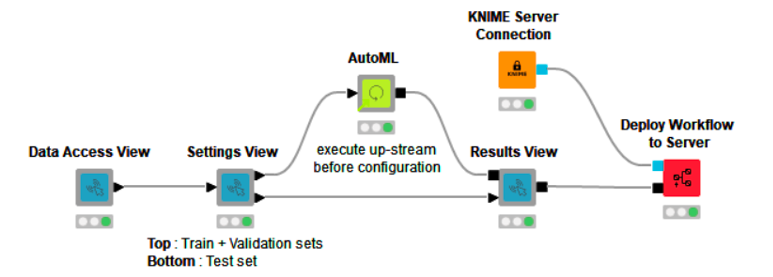
How do you build this sequence of four interactive views controlling the autoML component in a workflow? Well, with more components – one component for each interactive view. Those additional components contain Widget and JavaScript nodes, which are rendered as different visual elements in each component’s Composite View.
The data scientist can set up just the right amount of interaction for anyone else in the company directly from our Analytics Platform. The resulting example workflow (Fig. 1), AutoML Component via Interactive Views, which we created, is publicly available on the Hub and can be downloaded and tested with our Analytics Platform.
Note: Before “integrated deployment” we used the term “guided automation” to refer to guided analytics in an autoML application. This term is still relevant but also linked to a much more complex workflow, which we don’t cover here, yet.

Our guided analytics workflow for the autoML component is a simple example that shows how the autoML process can be controlled via interactive views. The workflow produces four interactive views that result in a guided analytics application.
If the workflow is downloaded from the Hub and deployed to our server, you can use it to automatically train machine learning models. It can be executed directly via a web browser via our WebPortal.
Note: The workflow can also be run on our open-source Analytics Platform with example datasets and without the deployment aspect. (Right-click any component and click “Open Interactive View.”)
How Does the Guided Analytics Application Work?
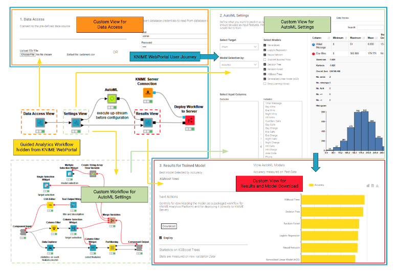
Let’s dive now a bit more into how the guided analytics application works (Fig. 2). The first custom view “Data Access View” (in orange – Fig. 2) generates an interface to load the data into the workflow (in yellow – Fig. 2). On our platform, this can be done in countless ways depending on your organization’s setup.
In our example, the default behavior is to load data from a simple SQL database, if credentials are provided. The data is cached in a CSV file updated each time the workflow is executed. If the user manually uploads a new CSV file this would replace the SQL query.
Once a dataset is provided, the user moves to the second custom view “AutoML Setting ” (in light green – Fig. 2). At this point, the WebPortal business user can interact, totally unaware of the connected Widget nodes, and define the target column, filter the input feature column, add which machine learning algorithm should be applied, as well as select the performance metric to be used. Once the input from the WebPortal user is provided, the autoML component executes on the server using all the necessary computational power.
The last Custom View “Results and Model Download” (in red – Fig. 2) shows the best model, which is automatically selected based on the performance metric provided by the business user. It also provides information about the performance of the other generated models listed in a bar chart.
The best model deployment workflow can now be downloaded and opened in the Analytics Platform and/or deployed to the server. In Fig. 2, you can see the full WebPortal User Journey (in blue), which the guided analytics application guides the business user through. At any point, the business user can go back and try something different to see how the results change, no need to code R or Python or drag and drop a single node: The business user simply interacts with the views moving through the process using the “Next” and “Back” buttons.

Data Partitioning to Train and Validate
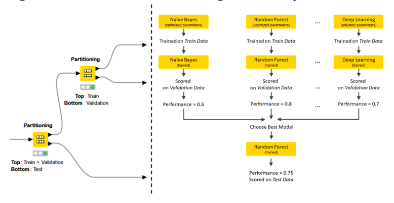
Another important aspect of the workflow is how the data is partitioned. The autoML component itself partitions the data into the train and validation set. On the outside, however, the “Settings View” component creates an additional test set partition. The final “Results View” component scores the output model via a Workflow Executor node and measures its performance again and displays it to the business user on the WebPortal. This practice (Fig. 3) is quite powerful, as the user can witness right away if there is a huge drop between the performance reported by the autoML component on the validation set and the performance reported by this final evaluation on the test set. If there is a big difference it might mean the model is somehow overfitting the validation partition.

Wrapping Up
In this article, we have explained how to build a guided analytics application around the autoML component to give the business user an easy process to automatically train machine learning models. Our example was a simple example. For a more detailed blueprint, check the workflow Guided Automation, also available on our Hub. The Guided Automation workflow group additionally covers feature engineering, feature selection, customizable parameter optimization, distributed execution, and a bit of machine learning interpretability/XAI.
(Originally published on the KNIME blog.)
