
Good data visualizations boost business data literacy by presenting well-thought-out dashboards or reports that show data assets for quicker and more straightforward consumption. Following data visualization best practices leads to positive outcomes for organizations. These benefits include reducing the time and costs of questions data consumers ask by answering them up front in the data visualizations. Additionally, good visualizations increase consistency in the end-user experience and encourage data usage for business planning and operations.
How do companies’ data visualization best practices improve their workers’ data literacy and get the benefits mentioned above? Serena Roberts, co-founder and COO at Moxie Analytics, answered this question during the DATAVERSITY® Enterprise Analytics Online (EAO) event.
In her talk, Roberts explained how to do the following data visualization best practices:
- Put the most important information first
- Make visual elements meaningful immediately
- Keep visualizations simple and organized
- Design them with multiple use cases in mind and for one audience
- Choose charts wisely
Put the Most Important Information First
First, Roberts showed how to draw users to the most important information they need. She demonstrated showing improvements at the top of the screen in a Project Management Summary.

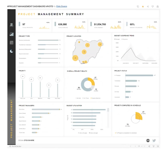
When comparing the dashboard before and after implementing the improvements, Roberts showed how she rearranged the top of the screen to hold the most important information: the critical KPIs matching business requirements. She orders the top of the screen as total projects, expenses, and budget with how that money is used, which ties project management success into revenues.
In another example, Roberts showed her changes to a Superstore Sales Dashboard.
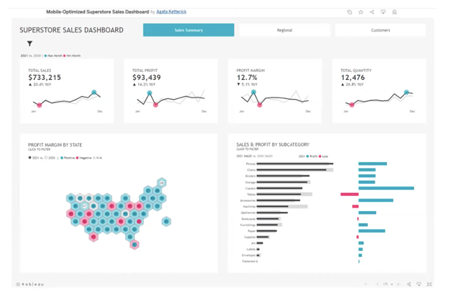
She rearranges the KPIs at the top to present them in a different order, per business needs and priorities. She checks with the business to see if her assumptions and the changes she makes meet the business logic. Roberts said, “It is a small but impactful change to put the most important information first.”
Make Visual Elements Meaningful
Like placement on a dashboard or report, the intentional use of colors or icons can relay quick, meaningful information. Take a colorful diagram showing an individual’s progress running:
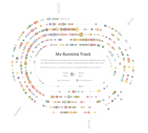
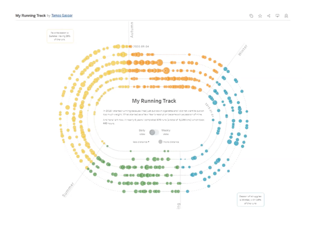
Roberts rearranged colors in the second image to show seasonal progress. She used orange for fall, blue for winter, green for spring, and yellow for summer to show how running changed over the season.
Like the intentional use of color, icons can help users process meaning more quickly. Roberts shared changes to a Company Call Center executive overview dashboard.

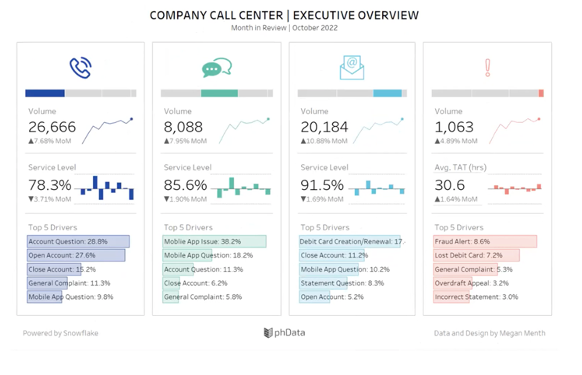
After adding icons to each column, the user compares the phone, chat, email, and incident columns. Roberts’ example demonstrates the power of icons; she recommended the Noun Project when looking for icons to use.
Keep Data Visualizations Simple and Organized
When Roberts discussed dashboard simplicity and organization, she focused on presenting enough information. She said:
“Don’t overwhelm users when they pull up the dashboard with too much to see. However, give data consumers access to get answers for their first and second-most top questions so that they don’t have to do extra work to get the answer and submit another request.”
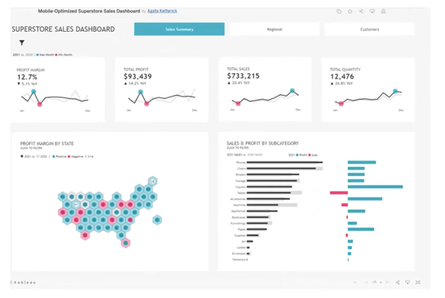
She advocates for a simple grid layout, as shown in the improvements in the Project Management Summary and Superstore Sales dashboards. Roberts even pointed out that after the dashboard changes, some visuals could be put on another page, simplifying visualization further.
She considers using hover-over functionality and labels in the dashboard to tell users what each attribute means in a simple and organized way. When labeling, Roberts suggested human terms instead of database ones, or including a field glossary if that is a better option.
In using any visual feature, Roberts advised doing so sparingly. She added:
“We don’t want to overfill our dashboard with unnecessary colors, lines, or other visuals or fill every nook and cranny of available space with stuff. Less can be more. Take advantage of white space.”
Design With Multiple Use Cases in Mind and for One Audience
Getting data visualization right means making it simple, organized, and relevant to the business. The business should want to use the reports or dashboards. Roberts recommended the following approaches:
- Design with multiple use cases in mind by thinking about related stories that a businessperson could solve with the same dashboard or different filters. This approach makes it less cumbersome to maintain and improve data visualizations over time.
- Understand what audience will use the data visualization and construct their desired experience. For example, the C-suite will want a bigger picture view than someone who is a product manager. So, it becomes tricky to build one view for different audiences who want distinct experiences. While the context matters, Roberts advised pushing back on cramming everything into visualization for multiple audiences.
- Know how an audience will “consume and interact with data visualizations.” When gathering requirements and designing, Roberts asked:
- What will users do next with the data from the visualizations? What decisions and activities will they make with this data?
- Will they export the data viewed to another application?
- What will the audience expect to see in the dashboard or report?
- How often will a businessperson check this dashboard and interact with the data?
- Mock up the dashboard through a sketch during requirements gathering to get the audience’s reactions and start good conversations about what they want.
Choose Charts Wisely
In her presentation, Roberts discussed typically used charts requested by her audience or suggested to them. She highlighted the following:
- Bar Chart: The bar chart is easy to construct, clearly sends a message, and is Roberts’ “best friend.” She advised using this data visualization when comparing one metric across one dimension, like sales by quarter. She also reminded her listeners that they can shift the orientation between vertical and horizontal for additional impact.
- Stacked Bar Chart: Although closely related to a bar chart, Roberts uses the stacked bar chart to display measurements across multiple dimensions. For example, this chart best represents quarterly sales and how each region contributed to the work.
- Line Chart: Roberts likes using line charts when “depicting how a metric trend across the same sequential dimension such as a date or time series.” For example, a line chart would show regional opportunities over the last 12 months.
- Combination Chart: Combination charts depict bar and line charts and can fit lots of information together. Roberts uses this visualization to view two or three related metrics, like movie duration compared with ROI and ratings.
- Donut Chart: Donut charts measure contribution to a whole across a single dimension, like total sales by region.
- Scatter Chart or Scatterplot: Roberts uses this chart “when looking for correlations between two metrics or outliers, like levels of particulate matter in the air by rainfall amounts.”
- Area Chart: This visualization emphasizes a “change in metric over time because users can process it easier than in a bar chart.” For example, use an area chart to show sales revenue over the last 20 years and how it has increased.
- Bullet Chart: Roberts recommends using a bullet chart to see “the current value, a previous value or values, and a target or an average.” She said sales teams like this visualization because they can see improvements from last year to this year.
- Bubble Chart: Bubble charts can show multiple pieces of data in a single visual because the size and bubble color can convey additional information. For example, a bubble chart can give sales by region, quarter by color, and profit by size.
- Funnel Chart: Funnel charts measure progress through several distinct phases, such as the number of opportunities in each sales stage. For example, leads have a large end of the funnel, whereas the sales to the customer appear at the end.
- Radar Chart: Roberts uses radar charts to visualize and compare data using shapes. She used a radar chart that depicted that the allocated budget for the development team scored the highest, but the marketing team spent more.
Conclusion
Roberts shared and demonstrated data visualization best practices to make dashboards and reports more impactful and relevant to an audience. She encouraged data professionals to take the best practices that work for them and to keep them consistent throughout the user experience to save development time.
Determining standards and templates makes these data visualization standards consistently achievable. She recommended getting feedback for visual standards and templates so that they are usable. By following her data visualization best practices and keeping these consistent across an organization, businesspeople can demonstrate high data literacy in one glance.
Want to learn more about DATAVERSITY’s upcoming events? Check out our current lineup of online and face-to-face conferences here.

Here is the video of the Enterprise Analytics Online presentation:

Image used under license from Shutterstock.com