
Click to learn more about author Paolo Tamagnini.
The Guided Labeling series of blog posts began by looking at when labeling is needed — i.e., in the field of machine learning when most algorithms and models require huge amounts of data with quite a few specific requirements. These large masses of data need to be labeled to make them usable. Data that is structured and labeled properly can then be used to train and deploy models.
In the first episode of our Guided Labeling series, An Introduction to Active Learning, we looked at the human-in-the-loop cycle of active learning. In that cycle, the system starts by picking examples it deems most valuable for learning, and the human labels them. Based on these initially labeled pieces of data, a first model is trained. With this trained model, we score all the rows for which we still have missing labels and then start active learning sampling. This is about selecting or re-ranking what the human-in-the-loop should be labeling next to best improve the model.
There are different active learning sampling strategies, and in today’s blog post, we want to look at the label density technique.
Label Density
When labeling data points, the user might wonder about any of these questions:
- “Is this row of my dataset representative of the distribution?”
- “How many other still unlabeled data points are similar to this one that I’ve already labeled?”
- “Is this row unique in the dataset — is it an outlier?”
The above are all fair questions. For example, if you only label outliers, then your labeled training set won’t be as representative as if you had labeled the most common cases. On the other hand, if you label only common cases of your dataset, then your model would perform badly whenever it sees something just a bit exceptional to what you have labeled.
The idea behind the Label Density strategy is that when labeling a dataset, you want to label where the feature space has a dense cluster of data points. What is the feature space?
Feature Space
The feature space represents all the possible combinations of column values (features) you have in the dataset. For example, if you had a dataset with only people’s weight and height, you would have a 2-dimensional Cartesian plane. Most of your data points here will probably be around 170 cm and 70 kg. So, around these values, there will be a high density in the 2-dimensional distribution. To visualize this example, we can use a 2D density plot.
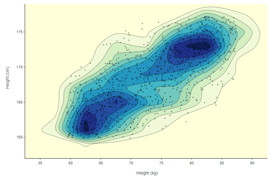
In Figure 1, density is not simply concentrical to the center of the plot. There is more than one dense area in this feature space. For example, in the picture, there is one dense area featuring a high number of people around 62 kg and 163 cm and another area with people who are around 80 kg and 172 cm. How do we make sure we label in both dense areas, and how would this work if we had dozens of columns and not just two?
The idea would be to explore and move in the dataset n-dimensional feature space from dense area to dense area until we have prioritized all the most common feature combinations in the data. To measure the density of the feature space, we compute a distance measure between a given data point and all the others surrounding it using a certain radius.
Euclidean Distance Measure
In this example, we use the Euclidean distance measure on top of the weighted mean subtractive clustering approach (Formula 1 below), but other distance measures can be used too. By means of this average distance measure to data points in the proximity, we can rank each data point by density. If we take the example in Figure 1 again, we can now locate which data point is in a dark blue area of the plot simply by using Formula 1. This is powerful because it will also work no matter how many columns you have.
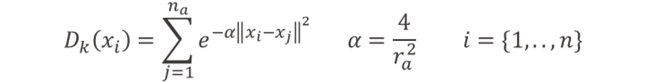
Formula 1: To measure the density score at the iteration k of the active learning loop for each data point xi, we compute this sum based on the weighted mean subtracting clustering approach. In this case, we are using a Euclidean distance between xi and all the other data points xj within a radius of ra.
This ranking, however, has to be changed each time we add more labels. We want to avoid always labeling in the same dense areas and continue exploring for new ones. Once a data point is labeled, we don’t want the other data points in its dense neighborhood to be labeled as well, in future iterations. To enforce this, we reduce the rank for data points within the radius of the labeled one (Formula 2 below).
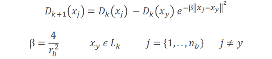
Formula 2: To measure the density score at the next iteration k+1 of the active learning loop, we need to update it based on the new labels: Lk from past iteration k for each data point xj within a radius of rb from each labeled data point xy.
Once the density rank is updated, we can retrain the model and move to the next iteration of the active learning loop. In the next iteration, we explore new dense areas of the feature space thanks to the updated rank, and we show new samples to the human-in-the-loop in exchange of labels (Figure 2 below).
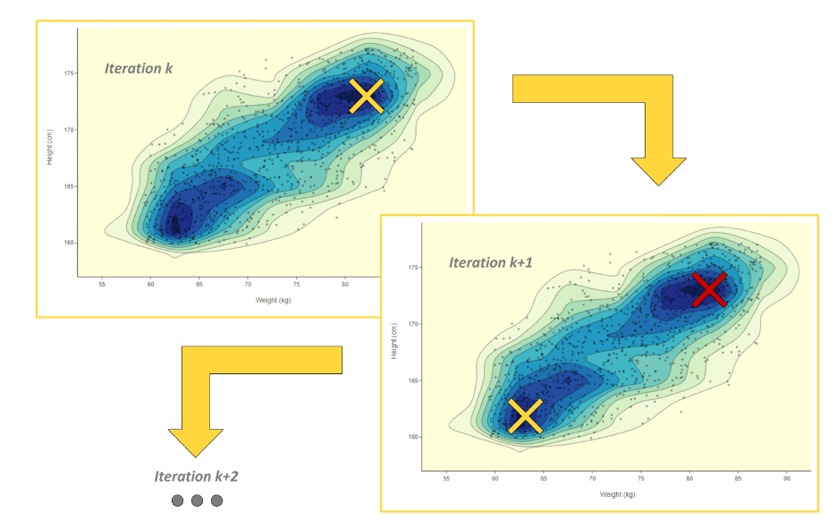
Figure 2: Active Learning Iteration k: the user labels where the density score is highest, then the density score is locally reduced where new labels were assigned. Active Learning Iteration k + 1: the user labels now in another dense area of the feature space since the density score was reduced in previously explored areas. Conceptually, the yellow cross stands for where new labels are assigned and the red one where the density has been reduced.
Wrapping Up
In this episode, we’ve looked at:
- Label density as an active sampling strategy
- Labeling in all dense areas of feature space
- Measuring the density of features space with the Euclidean distance measure and the weighted mean subtractive clustering approach
In the next blog article in this series, we’ll be looking at model uncertainty. This is an active sampling technique based on the prediction probabilities of the model on still unlabeled rows. Coming soon!
This is an on-going series on guided labeling, see each episode at: